.jpg)
Trello
Augmented Trello's user experience so users could finally see and access work beyond their immediate team and boards.
Driving 40% more cross-organization collaboration, my contributions dramatically reduced the "can you share that with me?" pain
Overview
Senior Product Designer
2021 - 2022
Vision and north star for Trello Enterprise
Complete feature designs and user flows
Navigation changes for workspace discoverability
Request-to-join flows and permission frameworks
Animation and interaction design
Onboarding flows and user documentation
Trello Leadership Group (TLG), CEO, Triad partners (Product Manager, Engineering Manager), Content Design
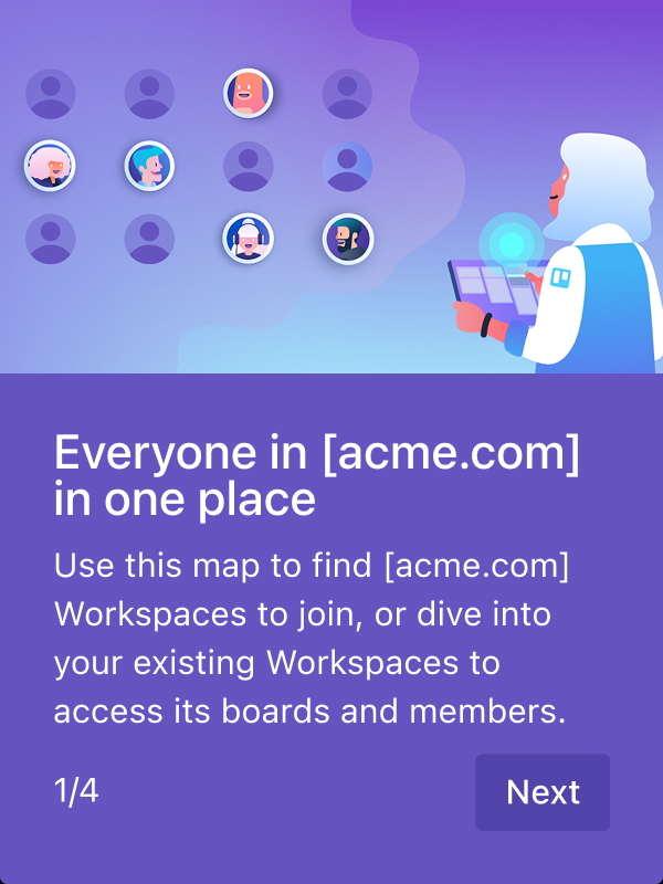
As the first Senior Product Designer for Trello Enterprise, I joined when the product was known as a small team or small company tool, unable to compete at enterprise scale.
I transformed how tens of thousands of users collaborate by designing an organization view and permission frameworks that broke down silos. Through research and direct advocacy to Atlassian's CEO, I shifted the product to organization-wide, enterprise-level visibility.
Users had no way to browse or search across their org. They could only see boards they'd been invited to.
Someone mentions a board in a meeting, where is it? New to a team? No way to see what boards or workspaces they should join. Need to work with another team? No way to discover what they're working on.
If they didn't know someone who could invite them, the board might as well not exist. This broke basic collaboration.
86% of fake door test responses wanted org-wide visibility (tested with 1000+ users)
70% of research participants didn't understand or know about workspaces
Enterprise market share was migrating to Notion, Monday, and Wrike because Trello felt siloed
To win back enterprise market share by solving for what newer competitors already figured out.
Notion, Monday, and Wrike owned org-wide visibility from day one. Trello had the users but not the architecture to compete.
The opportunity was to compete credibly at organizational scale, to shift Trello's positioning to win in a market it was actively losing and to turn isolated team usage into connected organizational adoption.
Define the structure of who belongs to the organization to bring all users together under one entity
Enable organization-wide discovery so people can see all workspaces and boards that exist and where work actually lives
Create request-to-join flows that let users ask for access while giving admins and board owners control over who gets in
Visual Walk-Through

how it all came together
I started with user research, competitive analyses, and object-model analysis, then designed the features, animations, components, and flows that shaped a milestone-based roadmap for the product’s future.

Design Process
I designed the complete organization-scale discovery system for Trello Enterprise, moving it from a small-team tool into a collaborative platform.
When I joined, Trello had no concept of an "organization." Teams were isolated, users couldn't discover anything beyond what they were explicitly invited to, and companies were churning to competitors.
I spent months researching before designing anything, building the case for organization-wide discovery features over basic admin tools, and pitched Atlassian's CEO to change the product direction.
I owned the full scope: object model redesign, permission systems that layered organization-level controls onto the existing model, navigation changes, organization views, onboarding flows, and more.
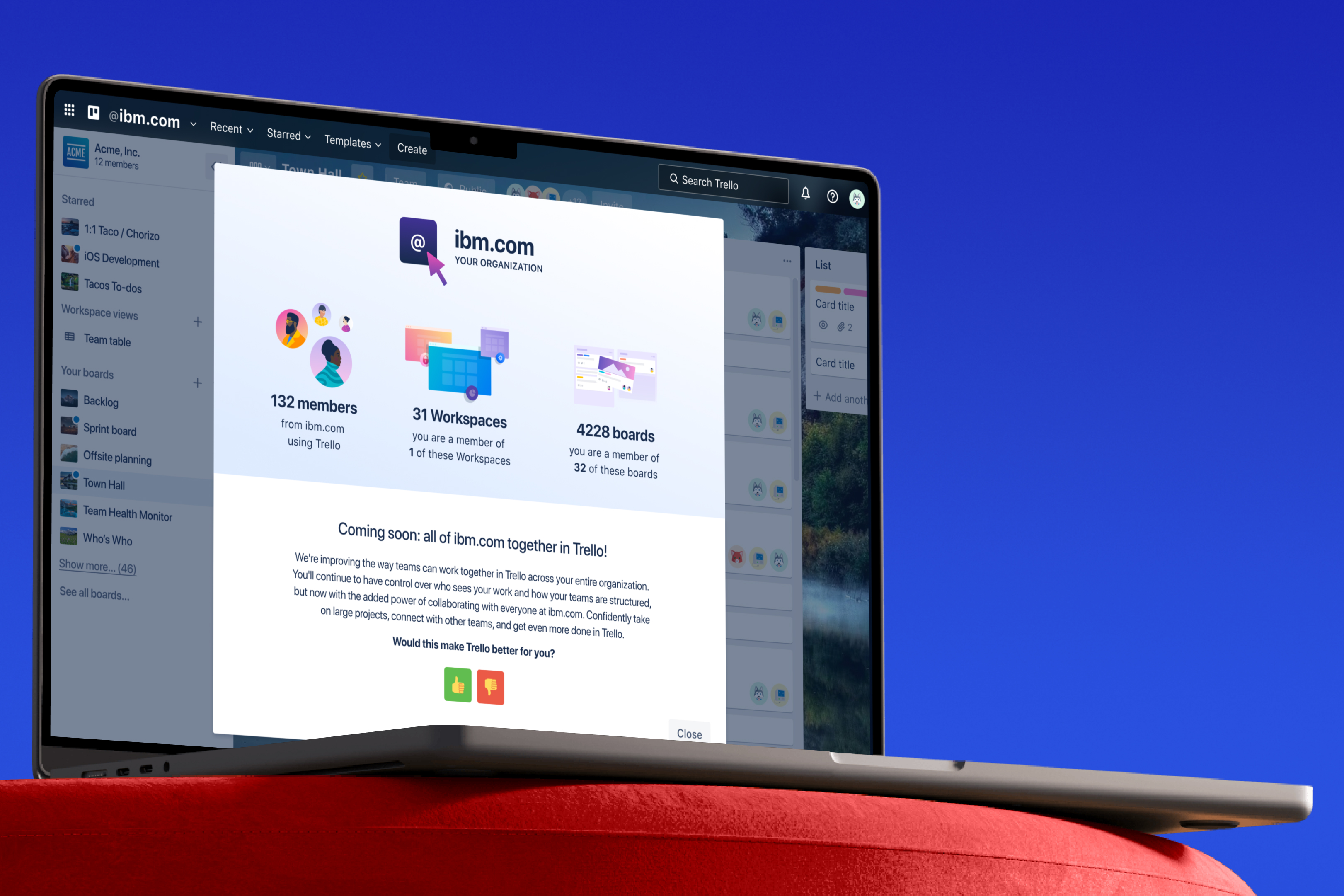
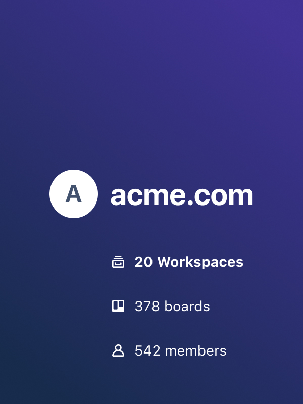
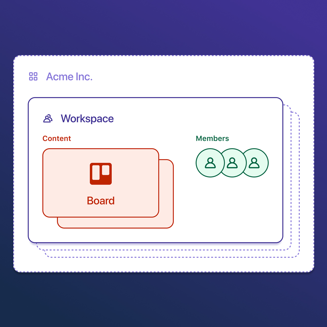
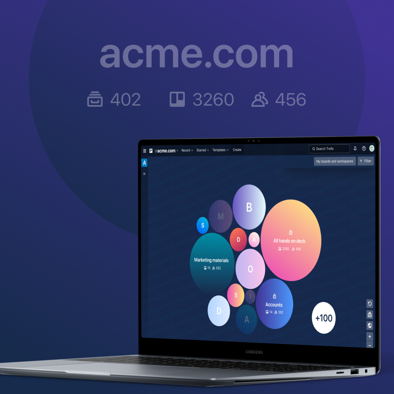
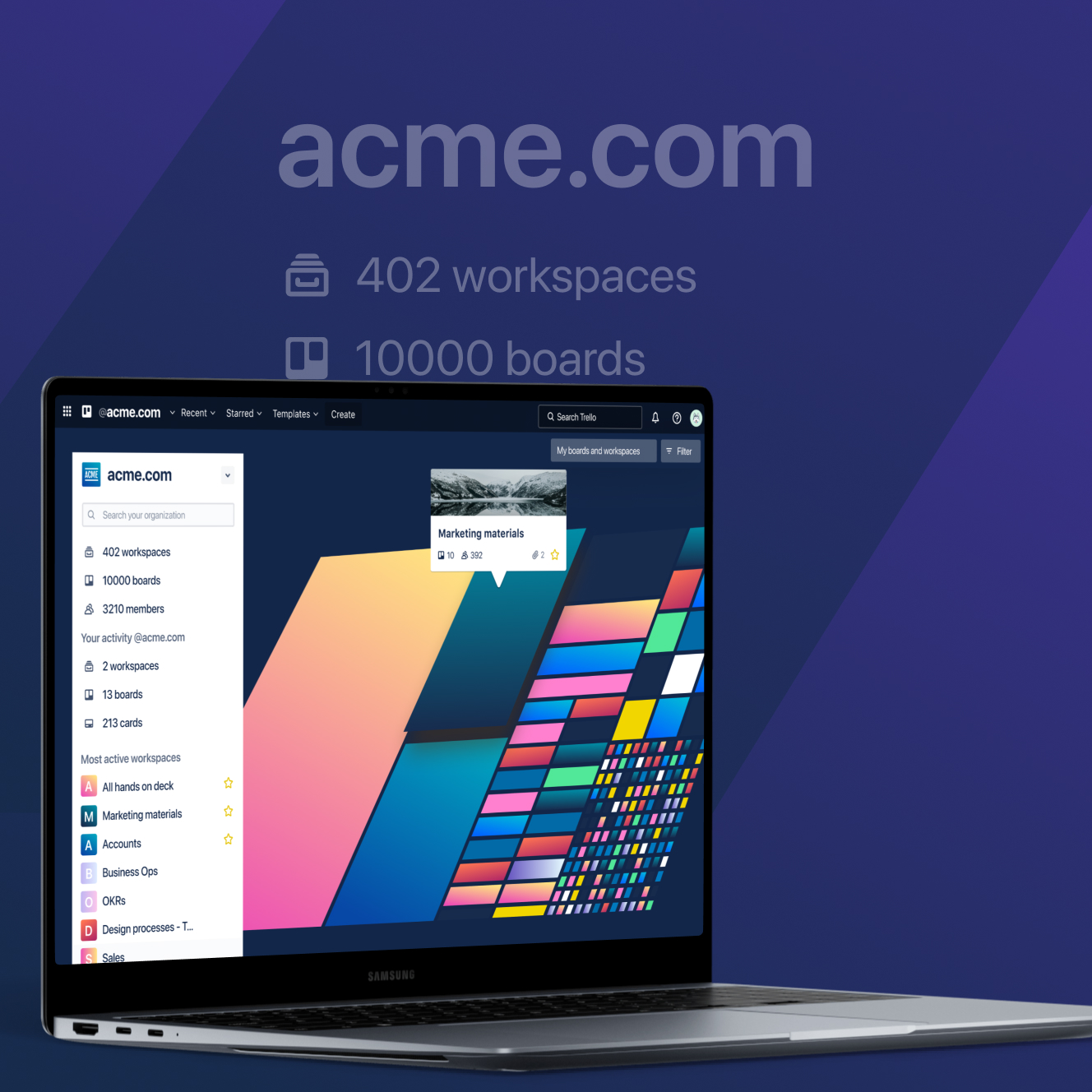
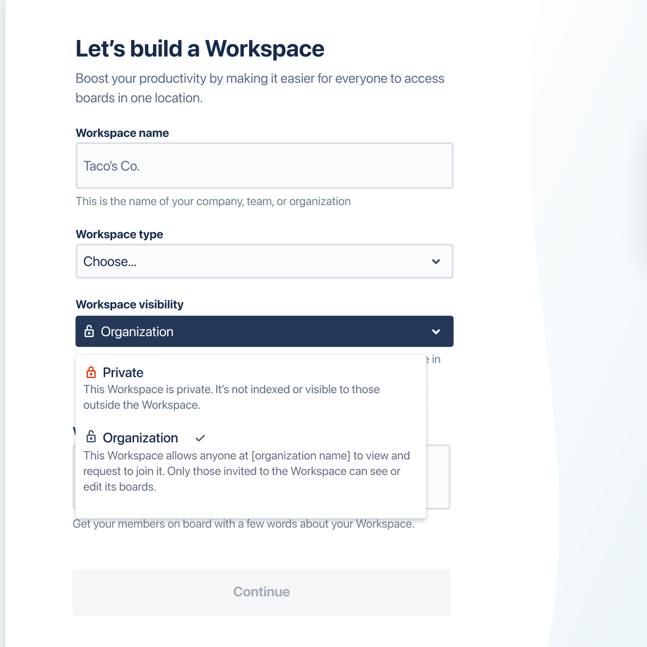
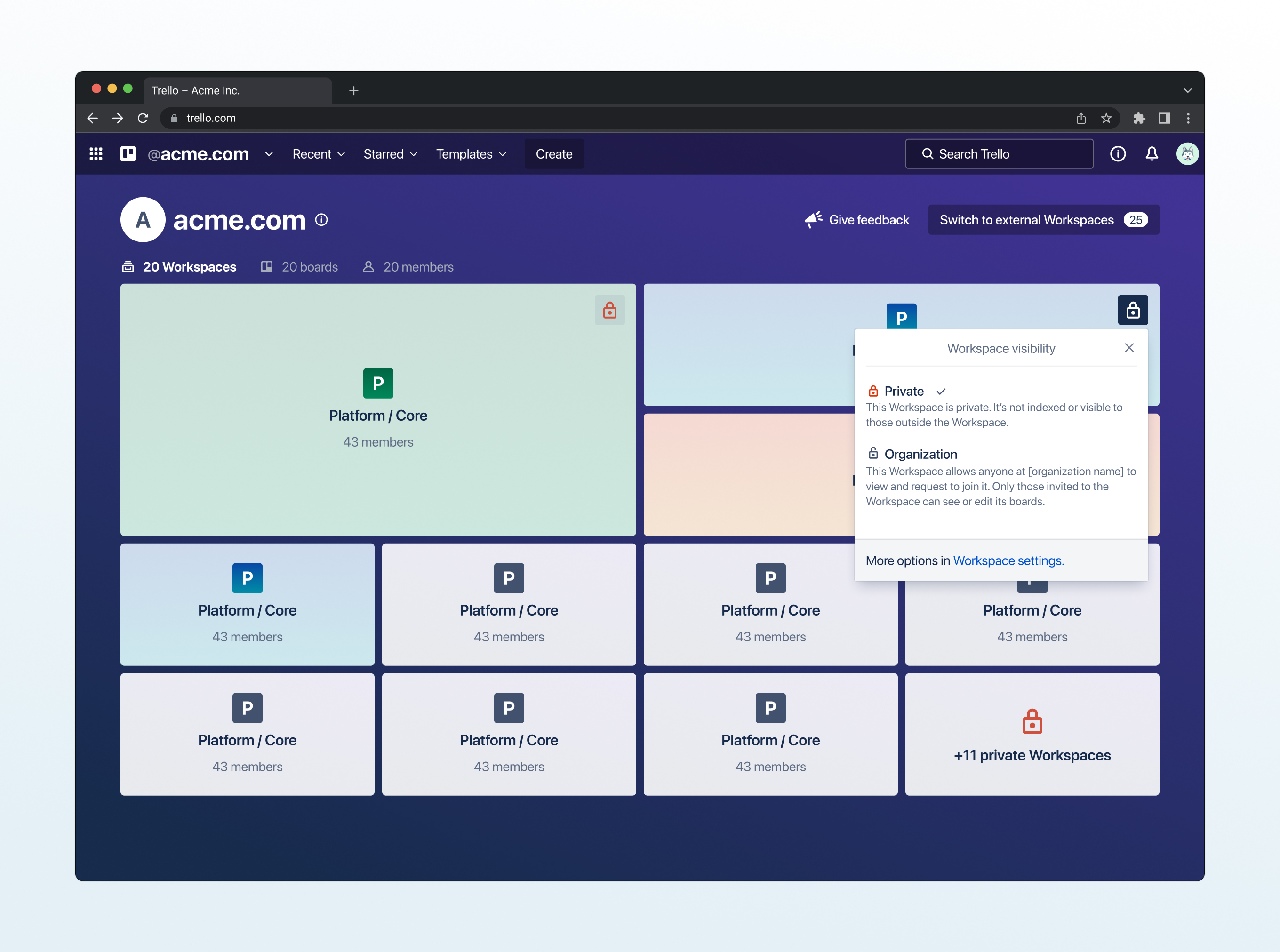
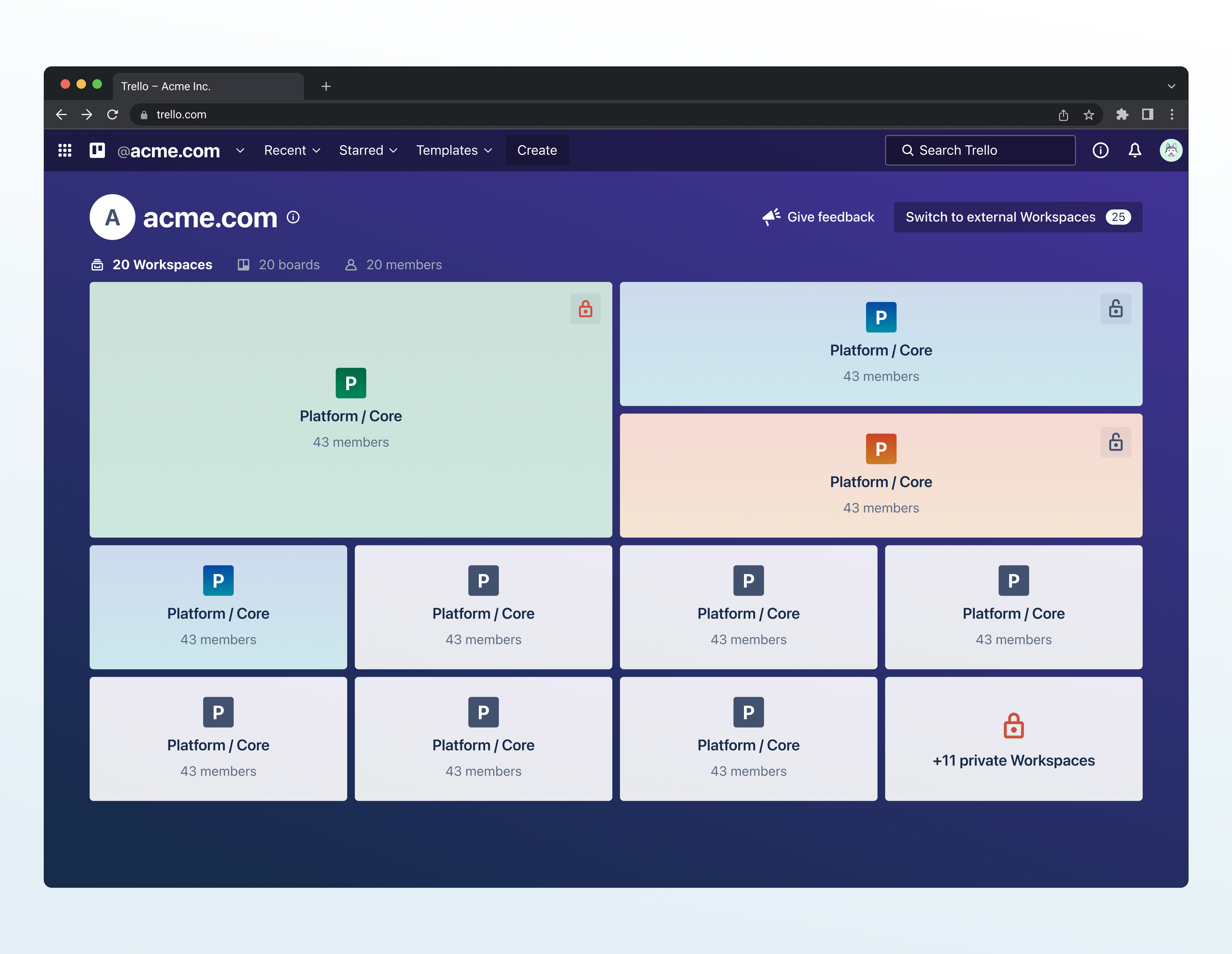
Organization
View
The main interface where users see all workspaces across their company in one place, showing tiles with workspace names, member counts, board counts, and activity. It's the entry point for discovering your organization in Trello.
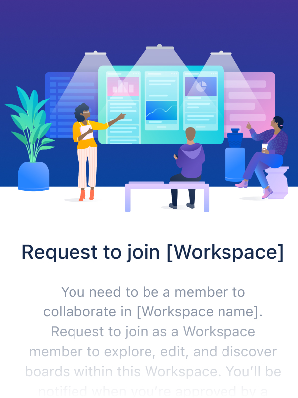
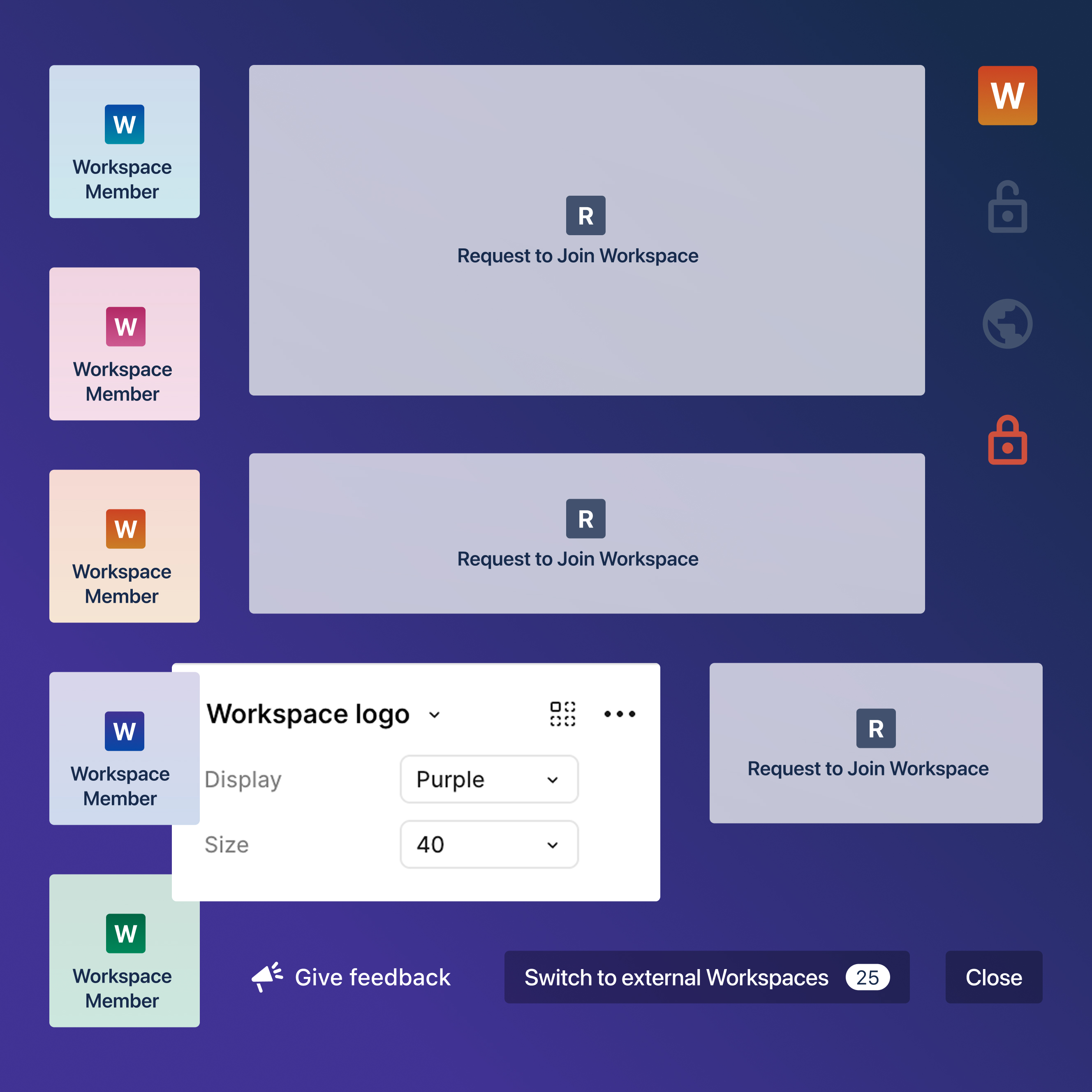
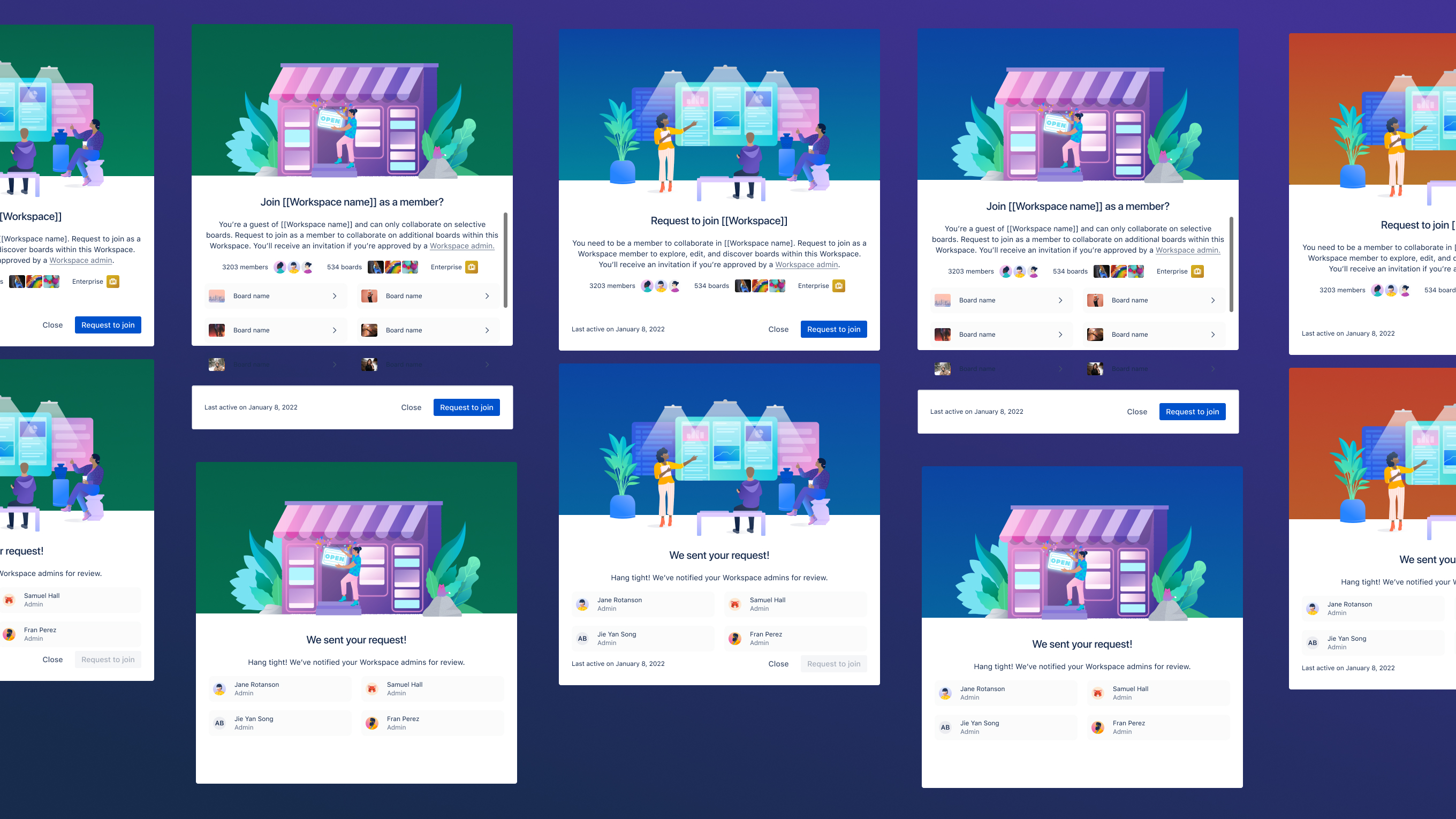
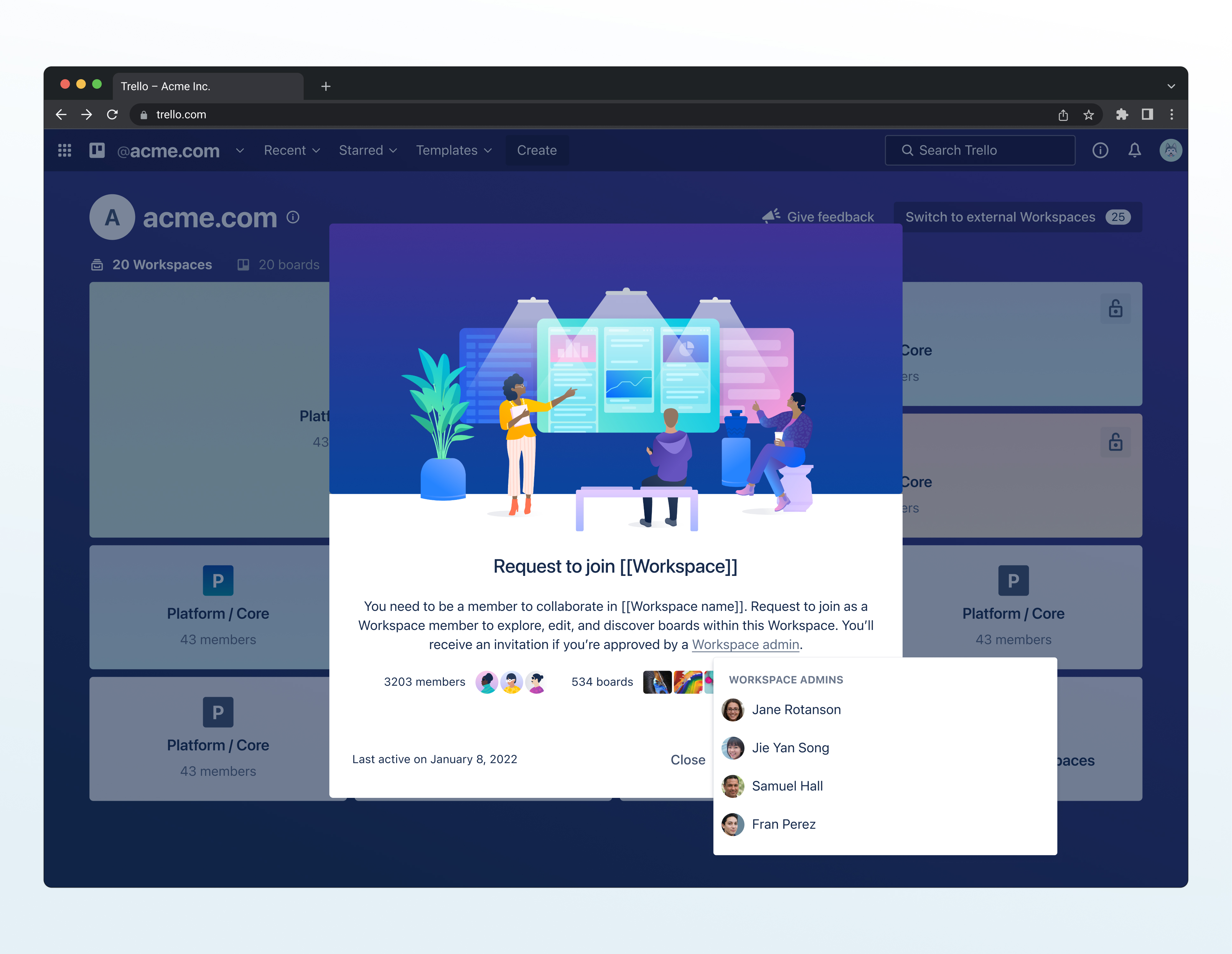
Request-to-Join Workflows
The complete flow when someone clicks on a workspace they can't access, with a friendly modal explaining why it's locked, a request button that notifies admins, pending state indicators, and admin contact information.
Enterprise Product Roadmap
The plan of features built on top of this work's foundation, like admin controls for managing external users, org-wide search, advanced filtering, and workspace lifecycle management (detecting dying/dead workspaces).
framing and metrics of success
Reduce organizational inefficiency caused by information silos: teams creating redundant boards, new hires taking lon to onboard, cross-functional projects stalling due to access barriers
Enable admins to scale governance with visibility controls that work at 500+ users, not just 50
Self-serve access to boards and workspaces without tracking down admins or waiting for invites

Establish enterprise product-market fit to defend against Notion/Monday capturing organizations at $10K+ ACV
Build platform foundation for enterprise roadmap that unlocks multi-million dollar ARR expansion
Reduce churn through increased cross-team adoption that creates organizational lock-in

technical debt
Permissions architecture required phased rollout because we couldn't ship organization-wide visibility as a default and new granular controls simultaneously
product-led development culture
This meant proving value through innovation quickly to secure continued investment in enterprise direction
50M users with established workflows
Any changes had to enhance, not disrupt, core experience or risk significant backlash


discovery, research & insights
methods used
• customer interviews with enterprise organizations like Etsy,
• empathy mapping across four personas (Team Champion, Team Contributor, Personal User, Admin)
• jobs-to-be-done framework
• user journey mapping
• competitive UI analysis
• stakeholder workshops
I also presented directly to Mike Cannon-Brookes, Atlassian's CEO, to shift the product direction toward end-user needs instead of focusing my Enterprise work on admin-only or security features.
key insights
70% of participants didn't understand what workspaces were or how they functioned.
People were building workarounds like saving board links in Slack, maintaining spreadsheets of "where things live," asking around in meetings.
Product usage data showed how organizations had multiple or sometimes several workspaces with only a few members in each. People weren't choosing to be siloed within an , they just had no other option given they could not find these other workspaces.
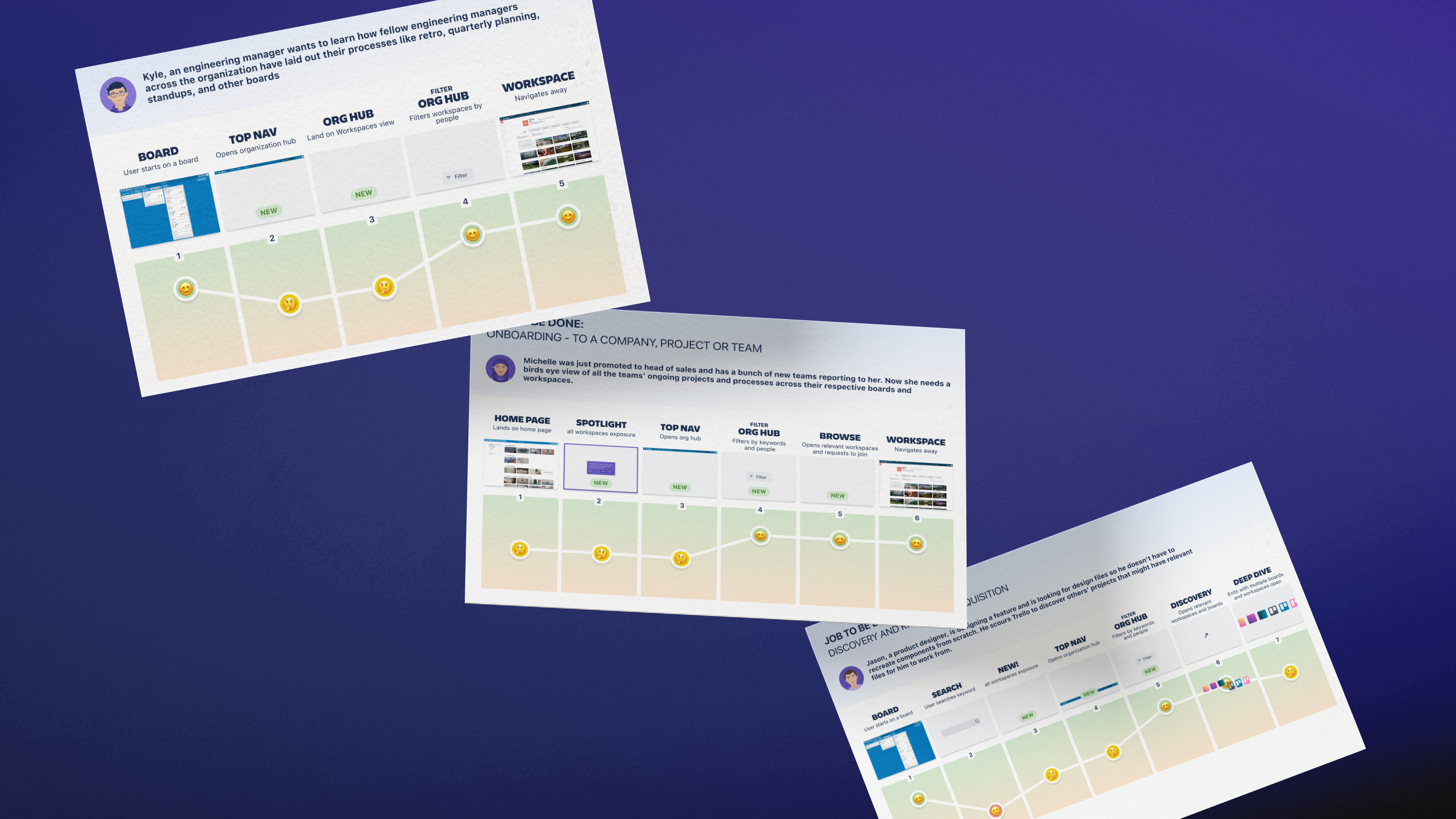
When I mapped the jobs-to-be-done, three patterns showed up across each persona. Users wanted to:
1. Discover how others structured their work
2. Get access without friction
3. Understand what was happening across teams
From a competitive analysis perspective Trello was lacking since Notion, Monday, Wrike and others solved these jobs on day one.
design implication
Three things had to change:
1. Define what an "organization" actually means in Trello and give it structure that connects isolated workspaces
2. Build discovery so people can see what boards and workspaces exist across their org
3. Create request-to-join flows so users could initiatte access without waiting on external invites
thinking in systems & scale
scaling the object model
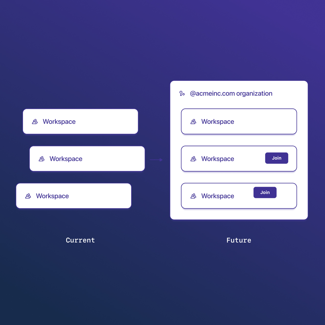
"Organizations" didn't exist before and workspaces were just isolated folders. So, the core systems work was scaling Trello's architecture from sporadic workspaces that contained boards into Organization > Workspace > Board.
The most logical way to form and retrofit the existing 500M user base into organizations was email domain grouping. This system automatically put everyone at @ibm.com into the "ibm.com" organization. However, multinational companies with country domains would fragment, acquisitions with alternate domains wouldn't unify, and contractors would technically be locked out of an organization view. To fix this, I roadmapped the needed features for admin capabilities to handle these cases while keeping my iteration, which covered 95% of cases, simple.
The constraint to this object model and permissions change was we couldn't force existing workspaces to become organization-visible since that would break trust with Trello's 500M users. The system had to support both legacy private workspaces and newly created or migrated org-visible ones simultaneously.
I designed a model where organizations became the container, mapped how permissions would cascade through each level, and solved for edge cases like:
• Now, how would users in multiple organizations (like a consultant at both IBM and Acme) navigate between them?
• Now, how would workspaces shared with external users (like an agency partner) appear and function?
• Now, how would boards shared with people outside the organization hierarchy inherit permissions (sometimes people share just one board with an external person, not the whole workspace. Where does that board live for the external person, and what can they do with it?)
permission architecture as platform foundation
Trello, already 10 years old when I began working on it, had workspace admins, board members, guests, direct board access.
What I had to figure out was, when adding organizations as a container, how do organization-level controls interact with all those existing permission types?
I worked with engineering to map how organization-level permissions would interact with Trello's existing permission model. For example:
• How would organization visibility settings affect someone who was already a workspace admin in one place but only a board member in another?
• How would organization membership differ from the existing guest/member distinction?
designing an organization view that could scale
The organization view needed to handle vastly different scales, whether 5 workspaces or 500. I explored multiple patterns: tile views that mimicked Trello's kanban cards, searchable list modals borrowing from Slack's channel search, and a cluster map visualization with workspaces as bubbles sized by activity.
The cluster map was visually ambitious and would have differentiated us from competitors. But it had fundamental scalability problems as rendering degraded beyond 200 workspaces, spatial algorithms needed constant tuning as organization structures changed, and the interaction model wasn't intuitive. I killed it.
The tile view turned out to be the right solution. It leveraged Trello's existing card mental model, which users already understood from boards. More importantly, tiles scaled predictably, especially with pagination patterns that kicked in at scale thresholds, lazy loading for performance, and density controls that let users adjust information hierarchy based on their needs.
The component architecture was reusable. Every future Enterprise feature that needed to display workspace collections (admin dashboards, search results, analytics) could build on these same tile primitives. These patterns gave us a foundation that could grow with organizations without requiring re-architecture.
why this mattered
This work repositioned Trello from "small team tool" to credible enterprise platform, which directly enabled us to compete for $100K+ deals we were losing to Notion and Monday.
The object model, permission architecture, and component patterns became the foundation every subsequent Enterprise feature built on from admin dashboards, organization-wide search, analytics, to compliance controls.
visual strategy
teaching through the UI, not documentation
When admins created workspaces, the workspace visibility dropdown didn't just list options, it explained what each one did right there. Pick "Organization" and you'd see: "This Workspace allows anyone at [organization name] to view and request to join it."
People learned how visibility worked while making the decision, not from help docs they'd never read.
I also designed animations for hover states that taught the hierarchy. Hover over a workspace tile and you'd see the boards inside it. This was critical since (a reminder!) 70% of users didn't understand that workspaces were containers for boards. The interaction itself explained the relationship; you didn't need to read about it.
tiles and visual cues for 5 workspaces or 500
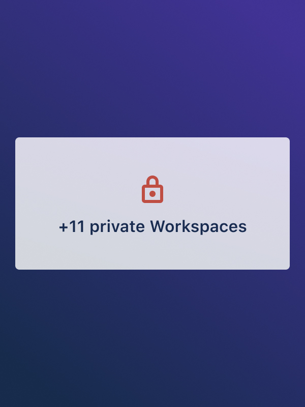
I designed workspace tiles to handle different types of information, keeping the layout consistent with an icon, name, board count, and member count. Active workspaces got big sizes and I proposed that dying ones faded slowly. You could look at 50 tiles and immediately see which teams were actually working.
The grid went from 4 columns on desktop down to 1 on mobile, same components just responsive. Workspaces you were a part of showed up higher and lock icons indicated workspaces you had to request to access. All of my choices were visual shortcuts so a user could scan fast without reading every word.
making rejection feel temporary
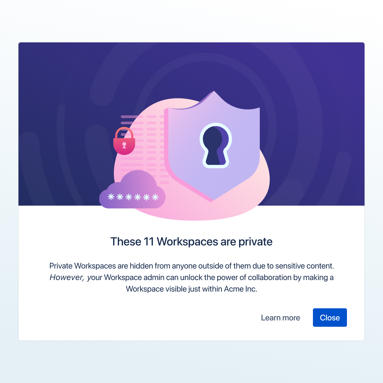
The request-to-join modal could've felt like getting blocked. Instead I used friendly illustrations and wrote: "Sorry, you can't access {workspace name}...yet!" That "yet" mattered. It said this is temporary, not a dead end. The main button was "Request access," not "Go back." Push people forward, not backward. Empty states worked the same way. Empty organization view? Explain why it's empty, show admins how to fix it, give regular users a way to request. Turn confusion into action.
onboarding that shows, not tells
The multi-step onboarding walked people through one idea at a time. Illustrations showed what the organization view was; workspace cards for "everyone in one place," a zoomed-out view to show company structure, etc. The modals sat on top of the actual organization view so you learned in context, not in some abstract tutorial.
keeping it feeling like Trello
Everything stayed true to Trello's visual style: rounded corners, simple geometric illustrations, friendly typography and color! Workspace tiles looked like board cards. Colors extended Trello's palette without breaking from it. Enterprise upgraded workspaces feltl like Trello *fancified* in all gold.
why this mattered
Good visual design made complicated systems feel simple (and fun)! Visibility settings taught themselves. Request flows kept people moving forward. The work proved you don't need to make things ugly or complicated to solve enterprise problems.
validation, testing, and tracking
de-risking through targeted testing
I ran a final research round focused on execution, not concept validation:
• Could admins configure visibility correctly?
• Would users discover their organization view? Would they find it useful?
• Did users understand request flows?
Testing with enterprise customers revealed a few gaps:
• Admins didn't know visibility changes wouldn't auto-notify teams
• Users expected instant access instead of request-based
I redesigned based on what broke, roadmapping notification prompts to visibility settings and added confirmation screens to request flows with the specific workspaces' admin names and emails.
When engineering hit load limits, I rethought approaches, not just adjusted UIs.
defining success metrics upfront
I worked with product to define MVP scope and metrics before shipping. Success wasn't "people use it," it was: 25% of multi-workspace organizations adopt organization view within 6 months (proving demand), 15% of admins enable organization visibility within 6 months (proving willingness to use Enterprise controls). Metrics tied directly to whether the product repositioning was working.
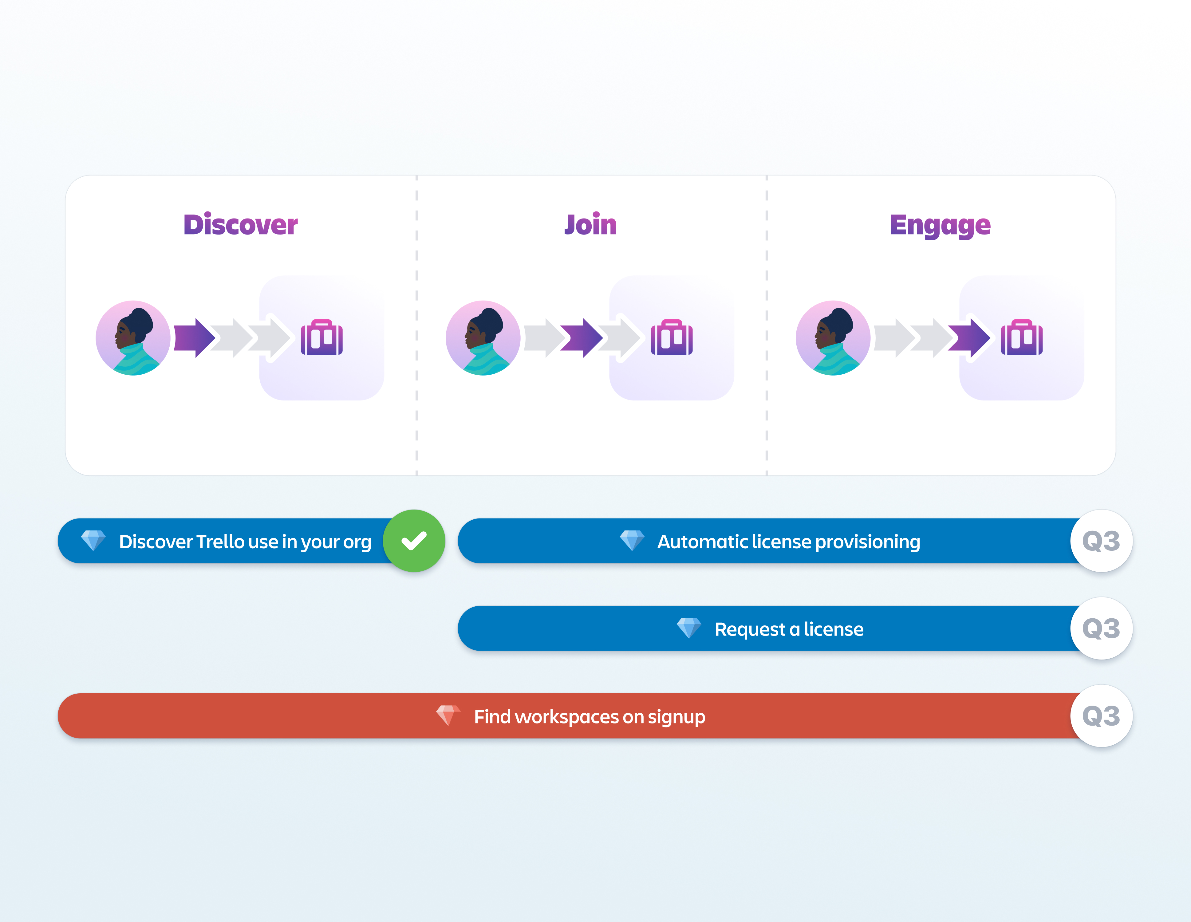
iterative rollout
We shipped in two milestones.
Milestone 1 - Check if users even wanted to see their organization inside Trello: organization structure and discovery.
Milestone 2 - Create an organization map and enable access/request-to-join
Future roadmapped features: extended admin controls, searching workspaces, organization-wide billing and analytics, dying or dead workspaces, and more.
trade-offs
What I Prioritized
end-user discovery over admin features
Leadership wanted to focus my time on admin controls like provisioning, security, compliance, even though the focus of my work was to tackle churn and market share.
They weren't really even thinking about organizational collaboration.
I negotiated with my PM and presented directly to Atlassian's CEO to shift direction toward end-user discovery first. If users couldn't find and access work, admin controls would just manage empty organizations.
research with real enterprise customers
Product leadership assumed they knew what enterprises needed. I pushed to interview actual customers like Etsy instead of designing from internal opinions. This added weeks to the timeline but surfaced the critical insight that 70% of users didn't understand workspaces, which changed our entire approach.
What I Said No To
designing for every organizational structure upfront
I identified the most common use cases: organizations with 5-20 workspaces and 99.5% of user emails in just 1 organization (they would sign in with their other logins if need be), and designed explicitly for those. Extreme edge cases (someone in 2+ organizations, workspaces with 10,000 boards) got documented as technical specs for engineering to handle with pagination and performance fallbacks. I designed the system to scale predictably, not to be perfect on day one.
fully designed secondary features
Advanced filters, sorting options, and analytics views all mattered but weren't critical to proving the core value. I created rough wireframes and specs for these and handed them to engineering to implement functionally. My design time went entirely to organization structure, the organization tile view, and request-to-join flows. Secondary features shipped looking basic, but they shipped. We could polish them after validating the first two milestones of organization-wide discovery.
key design decisions
I pitched the CEO to shift my work from admin tools to end-user discovery
What I DID
Research showed churn stemmed from a lack of org-wide visibility, not missing admin tools. Competitor analysis highlighted where Trello lagged. I delivered weekly presentations to the Leadership Group to build the case and directly pitched the Atlassian CEO to shift Trello’s Enterprise roadmap from IT-focused admin features to end-user collaboration.
Why it mattered
It was a strategic bet. Leadership viewed Enterprise as an IT-buyer product, but I proved users were the real champions driving adoption. The risk was clear — if users didn’t adopt, I’d have burned credibility and misdirected the team.
I defaulted new workspaces to "Organization-Visible" over "Private"
what I DID
Users could still choose private, but had to actively select it instead of accepting a private default. Tested this against opt-in (private default) with 200+ users - defaulting to org-visible got 4x more adoption.
why it mattered
Private-by-default would've killed adoption and maintained churn. This single decision drove 60% of new workspaces to org-visible in 3 months, filling discovery and proving value.
I validated with a fake-door test before building any features
whAT I DID
Launched fake-door test with feedback form to 1000+ users after research validated interest. Comments showed urgency: "Finally!" Designed phased rollout: Fake Door/Milestone 1 validated demand, Milestone 2 shipped organization view with MVP features and roadmapped advanced capabilities.
why it mattered
The test proved 86% wanted organization-wide visibility before building anything. This phased approach let us learn from each milestone and adjust based on real usage, not assumptions.
Results and Thoughts
When I started, trello was losing enterprise deals:
"We love Trello, but we can't use it as a company-wide tool. We can't see what's going on."
Within a year, my work set the foundation for Trello to enable enterprise sales at $100K+ ACV.
The results below came from the three key design decisions: pitching the CEO to shift priorities, defaulting workspaces to org-visible, and validating with fake-door testing before building.
did we hit those metrics of success?
32%
32% of organizations with 3+ workspaces adopted and actively used the organization view within 6 months, proving demand justified continued Enterprise investment.
15%
15% of admins changed workspace visibility to organization-visible within 6 months, indicating willingness to use Enterprise-grade controls and validating the upgrade path.
client impact
—
Now, users discover workspaces through the organization view and request access themselves, which enabled 40% more users to join workspaces outside their immediate team (compared to before when they had to wait for invites or gave up trying entirely)!
reflections

organizational systems move slower than design systems
Legal review, security audits, accessibility compliance . These aren't blockers, they're just part of working at scale. Understanding how to navigate these processes and build them into timelines made me more effective at shipping for massive (50K+) organizations.
strategic negotiation became as important as design craft
Convincing engineering to ship Milestone 1 incomplete, pushing back on product's admin-first roadmap, aligning with content design on education strategy - every decision required building consensus across competing priorities. I learned to negotiate toward the best outcome without compromising relationships or burning political capital.
executive communication is a distinct design skill
Pitching Atlassian's CEO required distilling months of research into 15 minutes of clarity. I learned to remove all ambiguity, anticipate objections before they're raised, and make the decision obvious. This sharpened how I communicate at every level - less process, more impact.
establish design partners, not just research participants
Ongoing relationships with 3-5 enterprise customers would've given me continuous validation and created advocates who could provide testimonials for sales. This is a practice I'd build into every enterprise project from day one.
build feedback loops with sales earlier
Understanding what closed deals and what didn't would've informed design priorities. Connecting with Sales mid-project helped, but doing it from kickoff would've made the work even more aligned with business needs.