BioPhy AI
Designed BioPhyAI from scratch, transforming conceptual AI workflow tools purpose-built for pharma's critical operations into a feature-rich platform.
From 0→1, my work ultimately secured a $4.2 million SOW from top-10 pharma and BioPhy's acquisition.
Overview
Head of Design • Founding Designer
2024 - 2025
Full 0 → 1 UX architecture for the entire BioPhy Ai platform
High-Fidelity Prototypes for 3 AI flagship modules
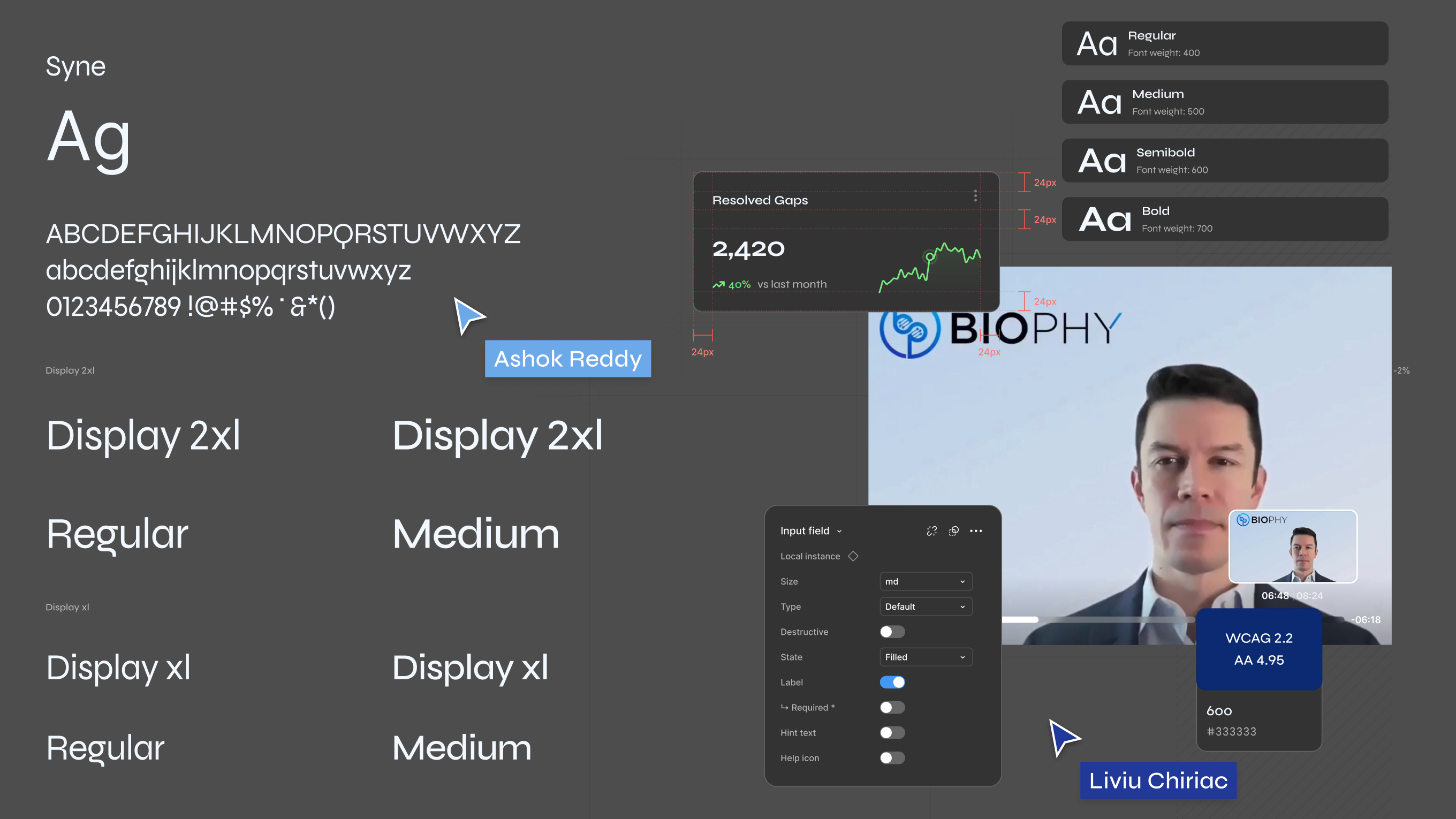
Complete BioPhy Design System (Figma) and visual design strategy
Module-specific workflows, interaction models, and AI logic documentation
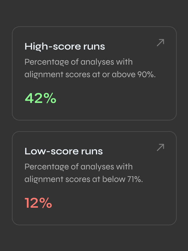
Compliance visualization framework and scoring logic (FDA/EMA/ISO)
Investor deck, 2-pager, and executive presentation demos
CEO, COO, CFO, AI Engineering, Data Science, Product Ops, and QA Validation


As Head of Design, I joined when the product was technically impressive but commercially unviable.
I transformed BioPhy by designing the entire identiy, interface and component system, defining the information architecture, collaborating with AI engineers on what data to surface and how, building the investor narrative, and driving user research which fundamentally changed our approach from engineering-led to user-driven design.
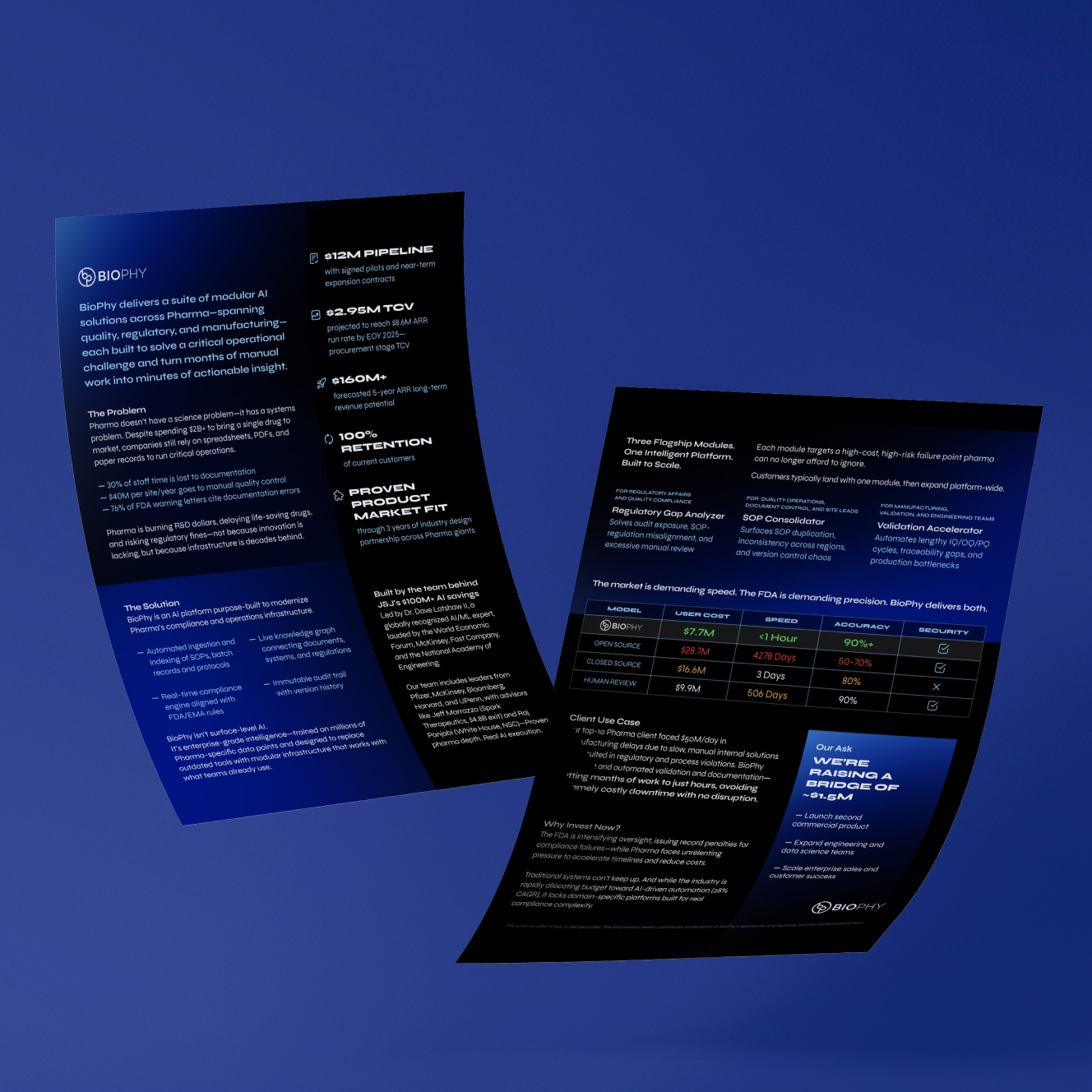
Pharma does not have a science problem. It has a systems problem.
Despite spending over $2B to bring a single drug to market, critical operations still rely on siloed spreadsheets, PDFs, and paper.
Teams spend months manually checking if: SOPs align with regulations, if records match protocols, or if validation documents are compliant. Every hour spent searching is an hour of regulatory risk.
30% of staff time is lost to documentation and rework
$40M per manufacturing site per year goes to manual quality control
76% of FDA warning letters cite documentation or record-keeping errors
The need to bring drugs to market faster is driving massive AI investment. Pharma lacks the tools to do it.
The FDA is issuing record fines while pharma faces mounting pressure to reduce costs. The industry is allocating 28% CAGR toward AI automation, but generic AI tools can't handle the regulatory rigor pharma demands. Pharma needs domain-specific AI built for operations and compliance complexity.
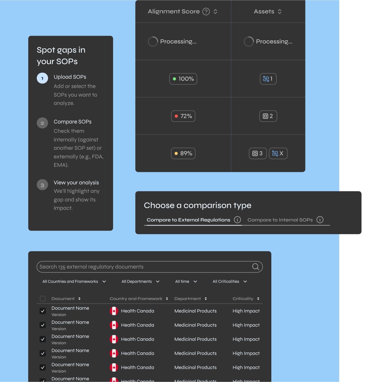
Ingest and index SOPs, batch records, and protocols
Compare documents against FDA/EMA regulations in real-time
Flags the right gaps, suggest fixes, and maintain an immutable audit trail
Visual Walk-Through

how it all came together
I started with user workflows and regulatory requirements, then built a system and interface that could scale.
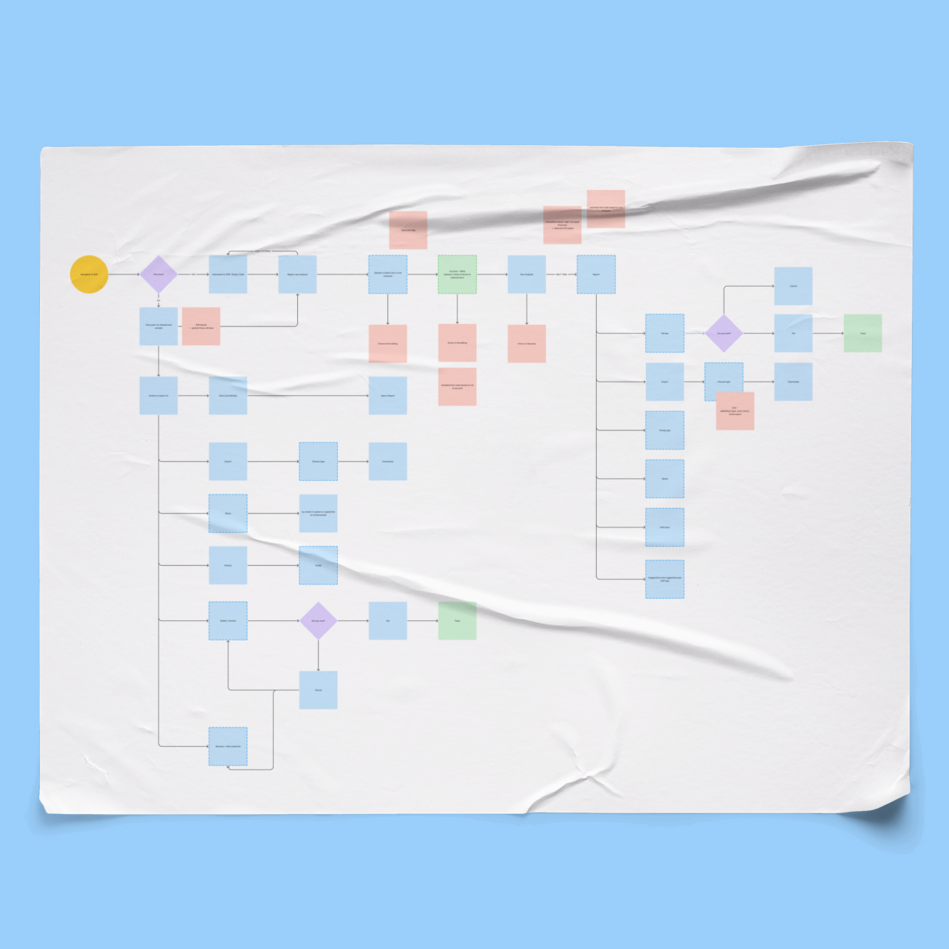

Design Process
I designed the entire platform and its three flagship AI modules, each which solves a high-cost, high-risk operation pharma runs manually today.
When I joined, BioPhy looked like pure developer output: no hierarchy, structure, or guidance.
So I rebuilt it. From zero.
I learned extraordinarily complex pharma workflows specific to quality managers, regulatory teams, and manufacturing engineers, then designed interfaces that reduced cognitive overload without hiding the information users needed to make decisions.
I owned the information architecture: what data the AI should output, how it should be structured, and how users would interpret it. Working directly with engineering and data science, I ensured the AI surfaced insights people could act on immediately, not just accurate data.
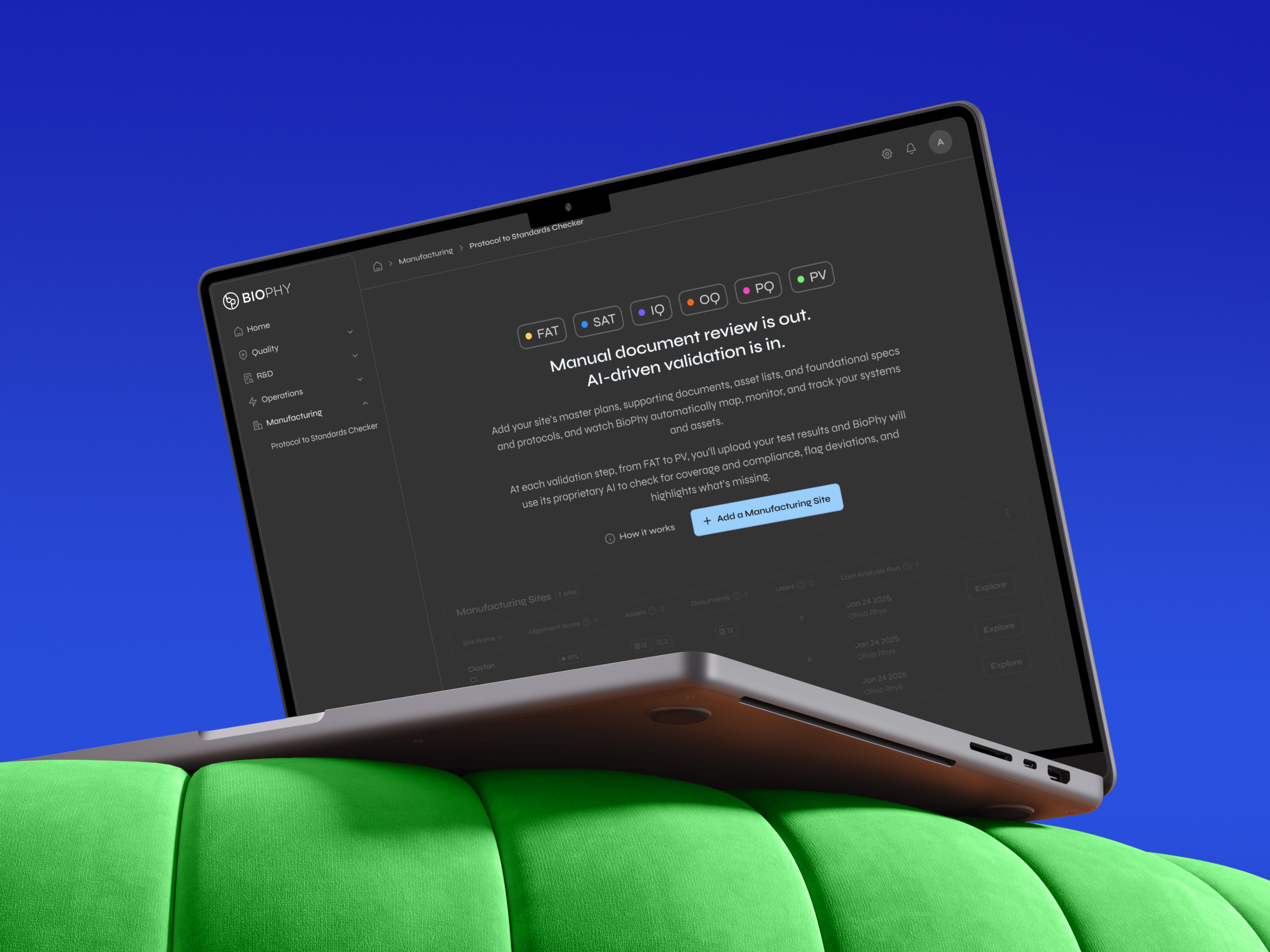
Regulatory
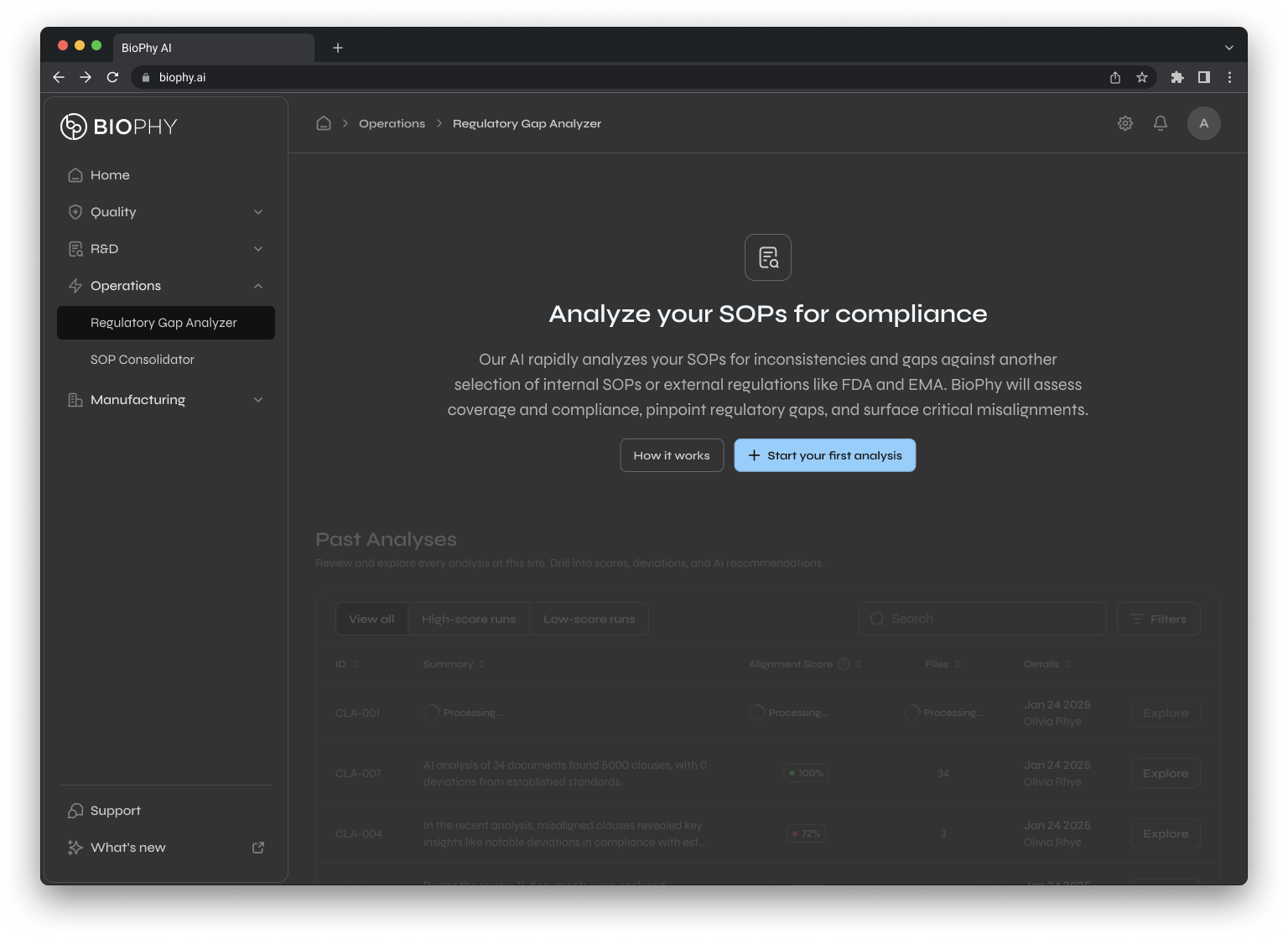
Gap Analyzer
Solves audit exposure and SOP-regulation misalignment for regulatory affairs and quality compliance
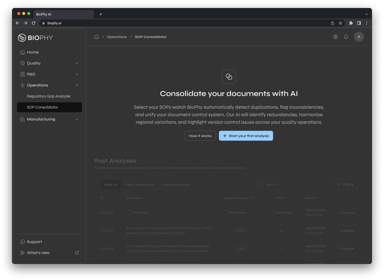
SOP
Consolidator
Surfaces duplication, regional inconsistency, and version control chaos for quality operations and document control.
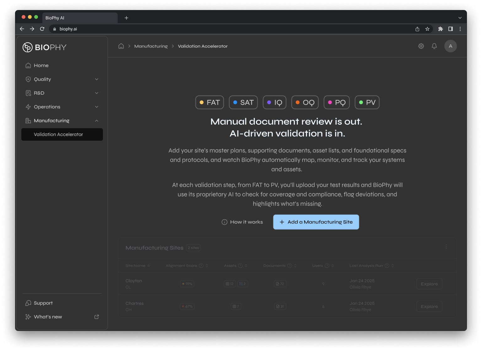
Validation
Accelerator
Automates lengthy process validation cycles and traceability gaps for asset and system manufacturing teams and engineering teams.
framing and metrics of success
replace file hunts with a single platform that finds, compares, and analyzes documents in seconds
use AI to flag missing information, rewrite noncompliant text, and score regulatory alignment
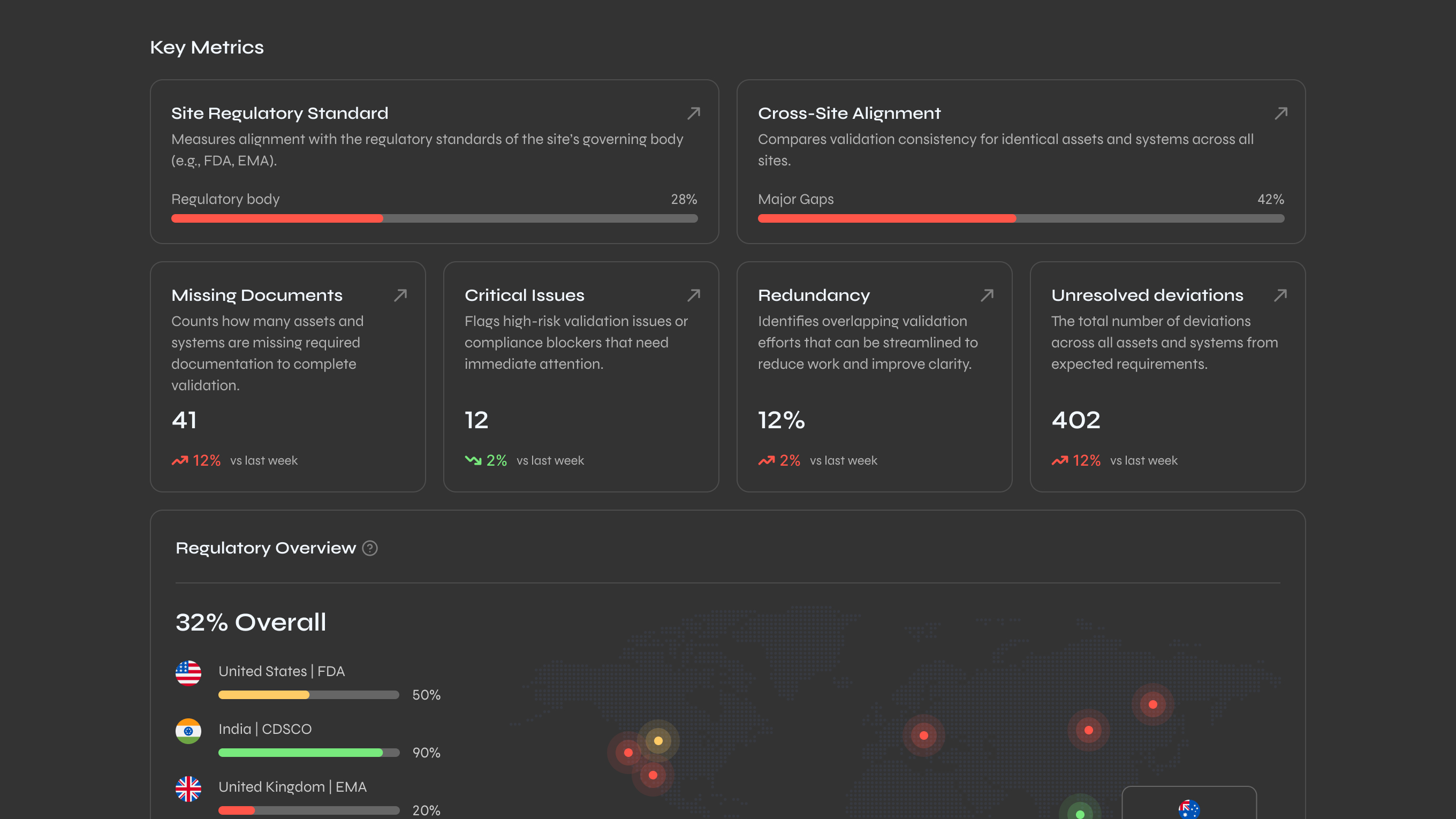
give leaders visibility into team performance metrics: SOPs aligned, assets validated, and where risk exists

prove measurable value with AI in critical, manual operations that cost pharma millions each year
show BioPhy can be intuitive and usable, not just functional
secure enterprise investment with top-10 pharma clients

speed
Aggressive deadlines to meet investor and enterprise timelines. I built reusable patterns and a scalable design system upfront to avoid rebuilding for each of the three modules.
balancing whale clients vs. scalability
Early clients requested highly specific workflow variations. I designed flexible configuration options within existing patterns rather than custom branches, protecting scalability while meeting their needs.
distilling ambiguous processes
Users had little insight into their own workflows and changed their minds frequently. I synthesized conflicting information and created structure where none existed.


discovery, research & insights
methods used
I ran workshops with stakeholders and interviewed users. Compared BioPhy to Veeva and MasterControl, the systems everyone in pharma uses. But the best insights came from just sitting with QA leads and validation engineers, watching them work.
Turns out what they told me in interviews and what they actually did were completely different things.
key insight
Everyone in pharma knows what good documentation looks like. That's not the problem. The problem is nobody has a shared system for actually creating it.
One quality manager showed me her process: download an SOP from Veeva, open it in Word, compare it manually to FDA guidance she keeps in a separate folder, mark up changes in Track Changes, email it to three different people for review, wait for feedback, consolidate comments, repeat. Every single time.
Everything lives in PDFs and spreadsheets and endless email threads.
design implication
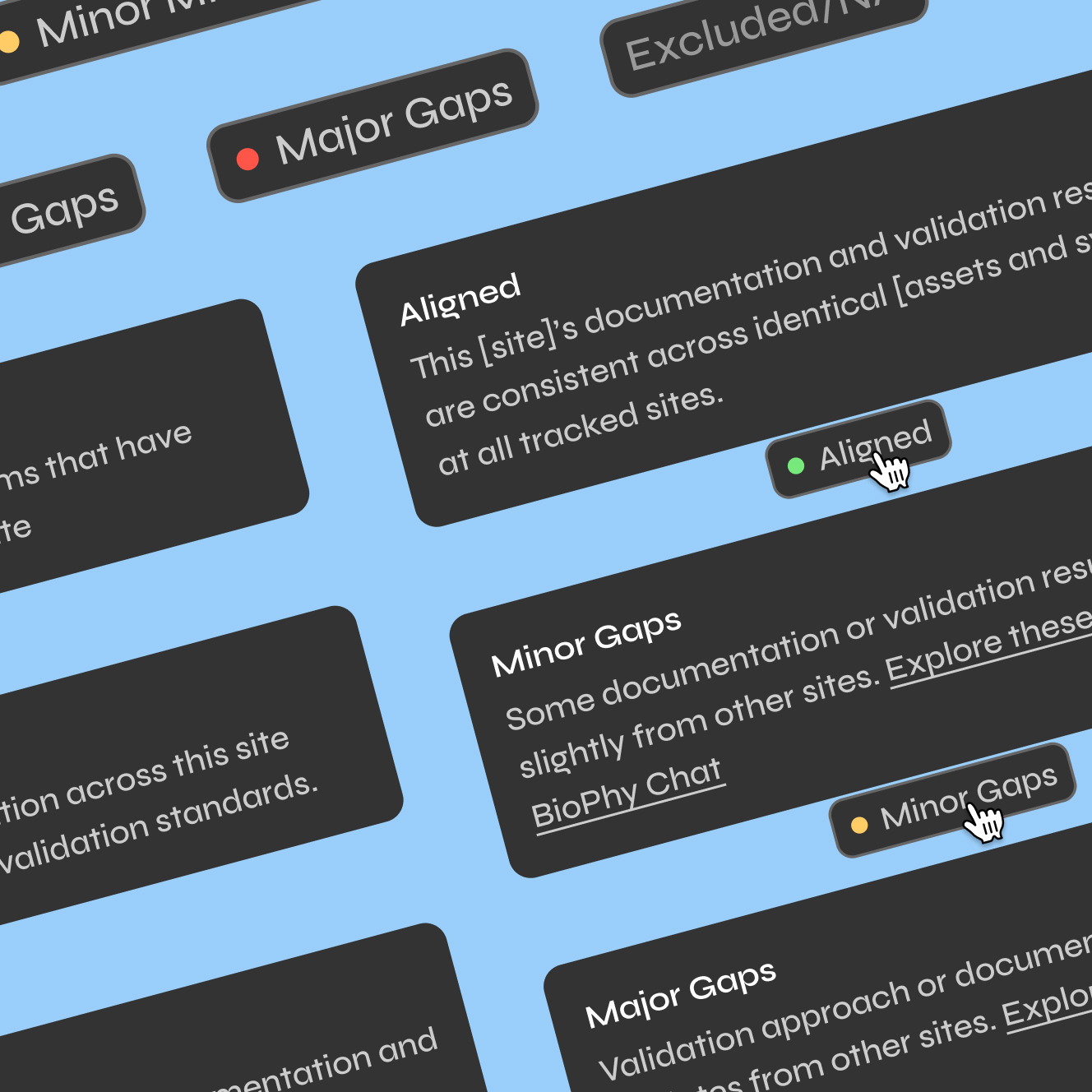
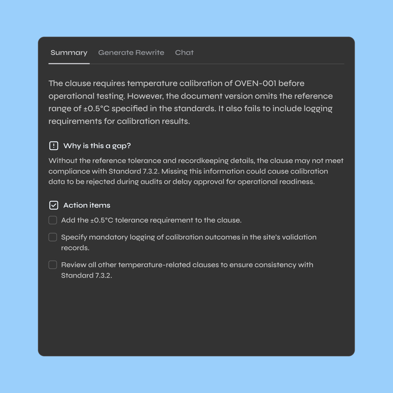
Most compliance tools are built for auditors who review work after it's done. BioPhy needed to help people while they're actually doing the work. Flag issues in real time. Explain what's missing. Show them how to fix it.
outcome
This is why I designed modules like the SOP Gap Analyzer the way I did. It doesn't just tell you "this SOP has 12 issues." It shows you exactly where the misalignments are, why they matter, and what compliant language would look like. The system guides you instead of just grading you.
thinking in systems & scale
architecting for scale
Early on I realized if I designed every module from scratch, we'd never ship. Each feature would take months. Every client request would spawn new components. The design system would become a junk drawer.
So I built reusable patterns that could handle pharma's complexity without customizing everything. The same components flex across regulatory compliance, SOP management, and validation workflows because the underlying logic is the same even when the content changes.
a shared mental model
Here's the pattern every module follows: select what you want to analyze, compare it against regulations or internal standards, see what's flagged, then act on it.
A validation engineer selecting equipment protocols goes through the same flow as a regulatory person analyzing SOPs. Different content, same mental model. Users don't have to relearn the interface. We don't have to redesign workflows. And the AI knows exactly where to surface insights because the structure is predictable.
That predictability is how we hit 98% accuracy.
designing intelligence, not just interfaces
I spent a lot of time with the data science team figuring out what the AI should actually do. Not just technically what it could do, but what users needed it to do.
Like, when should the AI flag something as a problem versus a warning? What counts as a compliance gap versus a stylistic difference? When should it suggest a rewrite versus just highlighting an issue?
We defined all of this based on real user intent, not assumptions. So the AI could get smarter as more people used it without us rebuilding everything.
visual strategy
unusable to investable
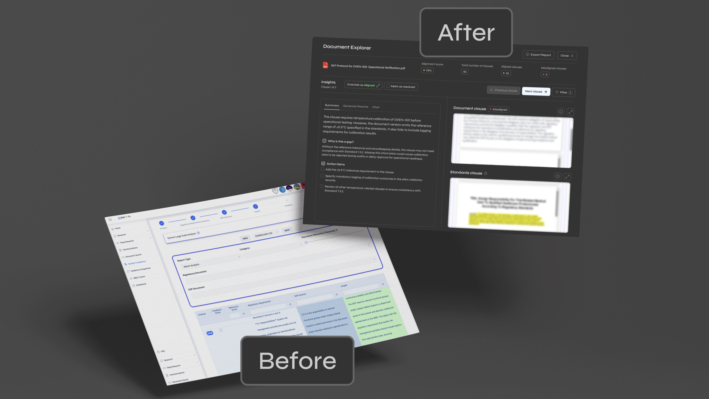
When I joined, the UI was killing deals. A senior pharma leader looked at a demo and said, "We know there's a Porsche under here, but we can't invest in something this unusable."
The product looked like engineers had designed it in a vacuum. No visual hierarchy. Buttons everywhere. Tables with 47 columns. Zero guidance on what anything meant or what to do next. And this is for people working in a regulated environment where a mistake can cost millions.
clarity over cleverness
I had one rule: don't hide information to make things look clean. Pharma users need context, not minimalism.
Removing text to simplify the UI just made people more confused. So I kept the information and organized it better. Clear labels. Consistent patterns. Structured flows that show you step by step what to do. I designed it like you're teaching someone a complex task for the first time, because that's basically what it was.
built for pharma, not generic SaaS
I had to actually learn how this stuff works. How validation engineers qualify equipment. How quality teams review batch records. How regulatory affairs maps SOPs to FDA guidance.
The UI couldn't be generic. A validation workflow for an autoclave is different from an SOP review, but both needed to feel like part of the same system. I had to understand the real work to design something that actually fit how people operate.
color as a language
Soft grays and blues; these users stare at bright white documents all day in fluorescent offices, so I built the whole thing in dark mode with reduced visual noise.
Status is dead simple: red means misaligned, yellow means caution, green means you're good. The entire platform teaches you how to read your compliance at a glance. High level scores at the top, drill into documents to see specific issues.
3 step mental model
Every workflow has three steps. Upload or select what you're analyzing. Compare it to regulations or standards. Review what's flagged and fix it.
Same layout every time. Same primary action. Same structure. You can dig into details if you want, but the core flow never changes. This made the product feel like one system instead of three disconnected tools stapled together.
before and after
Before: powerful AI buried under an interface nobody could use.
After: a system that actually looks and feels like the AI underneath it is worth something.
validation, testing and tracking
continuous validation loop
I worked with QA, machine learning engineers, and regulatory experts to validate that our workflows actually matched real compliance processes. Not what we thought compliance should look like. What it actually looks like in practice.
task based testing
We measured whether people could actually complete tasks. How long it took. Whether they understood what the AI was telling them. We ran this across SOP reviews and validation workflows because those were the highest stakes operations.
regulatory traceability
Every design change got documented with a rationale, then mapped to FDA and ISO requirements. This mattered because pharma clients need to show auditors why the system works the way it does.
trade-offs
What I Prioritized
core workflows over edge cases
I focused on the standard workflows every pharma company runs. Validation. SOP reviews. Regulatory gap analysis. The stuff that happens daily.
Complex edge cases, like integrating with legacy systems that use totally custom data formats, got pushed to version two. This let us prove the value of the core product fast instead of spending months on problems that affected 5% of users.
reusable patterns over custom solutions
I could've designed each module's interface from scratch. Faster short term, disaster long term. Instead I built a component system upfront. Slower initially, but by the time we hit modules two and three we were moving way faster.
AI explainability over shipping more features
There was a ton of pressure to add more AI capabilities. I pushed back hard. If users don't understand why the AI flagged something or how to fix it, the features don't matter. We needed transparency first.
What I Said No To
custom workflows for individual clients
Early clients wanted very specific variations to match their exact internal processes. I didn't build custom versions. I designed flexible configuration within the existing patterns. This kept us scalable while still handling about 90% of what they needed.
delightful interactions
This isn't a consumer app. Pharma users don't want surprise and delight. They want predictability. So I cut all the animations, transitions, and clever micro interactions. Instant feedback and clear information instead. The team thought it felt boring. Users thought it felt reliable.
key design decisions
I designed one mental model across three flagship (and future) AI modules
What I DID
High-level overview showing critical issues first, with drill-down capability. Same pattern across all three modules: select, compare, flag, act. Regulatory Gap Analyzer, SOP Consolidator, and Validation Accelerator all follow this structure.
Why it mattered
Users didn't have to relearn the interface between workflows. Development got exponentially faster by module 3.
The AI had predictable structure to work within, hitting 98% accuracy.
I designed AI features to fix, not just flag
what I DID
AI-powered rewrite suggestions for noncompliant text, direct links to specific FDA/EMA regulations, and explanations of why something was flagged and how to fix it. Prioritized this fixing functionality over system features like notifications.
why it mattered
Users could complete entire workflows without leaving the platform or emailing quality teams back and forth.
This is what closed the $4.2M deal. The Validation Accelerator replaced months of manual work.
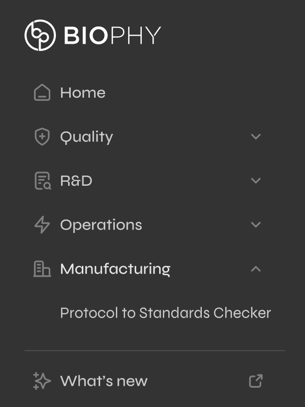
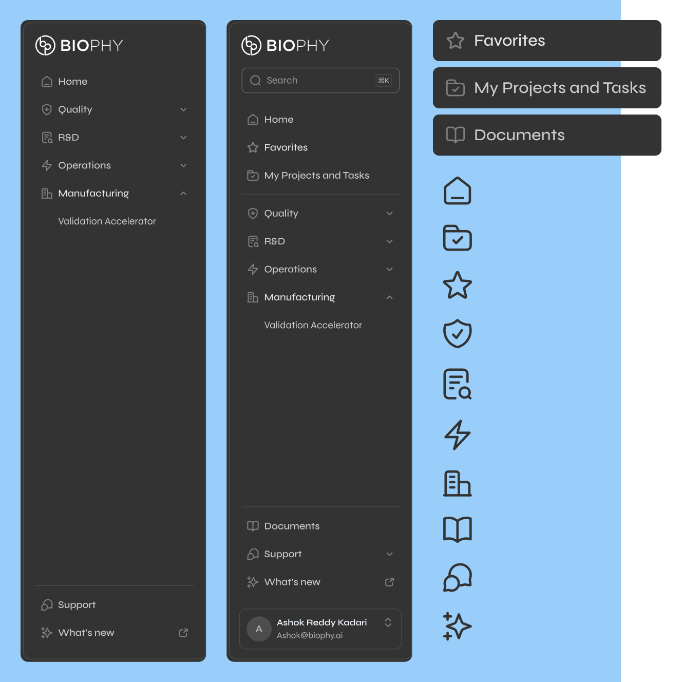
I shaped the navigation for both the user and sales strategy
whAT I DID
Organized platform by department (Quality, Regulatory, Manufacturing) instead of alphabetically listing modules. Restructured breadcrumbs and hierarchy to match how pharma teams actually operate.
why it mattered
Matched how pharma deploys software (by team, not feature). Created a clear go-to-market path: start with one department, prove value, expand platform-wide.
The nav structure became the sales pitch.
Results and Thoughts
When I started, the UI was blocking deals:
"We know there's a Porsche under here, but we can't invest in something this unusable."
8 months later, my work secured a multi-million dollar commitment, leading to the aquisition of the IP and product.
The results below came from the three key design decisions: the unified mental model/pattern, real-time fixing capabilities, and strategic navigation.
did we hit those metrics of success?
90%+
All users completed full workflows independently with only minor clarifications needed.
<1 Hr
To identify and resolve gaps vs. manual review and competitive AI solutions.
$4.2M
Exceeding the $1.5M target, leading to acquisition.
client impact
—
BioPhy stepped in and automated validation and documentation cutting months of work to just hours, avoiding extremely costly downtime with no disruption.
why BioPhy's AI won over pharma
The table below represents a full pharma operational cycle like process validation: reviewing all documentation, identifying compliance gaps, and generating audit-ready reports.
Purpose-built for pharma compliance. GxP validated.
(ChatGPT, Llama) not built for regulated environments.
(Cortellis, IQVIA NLP). Fast but lack pharma security and compliance.
Manual process. Expensive and resource-intensive.
reflections

design should earn investment, not just work well
The $4.2M deal came from making the product visually and functionally credible enough for pharma to bet on it.
I had to build the practice before I could build the product
The team didn't know how to make user-led decisions. I documented and implemented design process and pushed back on engineering-first approaches before I could design effectively.
every design choice needed an industry-specific and defensible reason
Pharma operates under regulatory scrutiny. I couldn't just say "this feels better;" I had to show why it met compliance standards.
test with messy data earlier
I designed assuming clean data.
Pharma data lives in PDFs and old databases. I'd run data audits upfront.
formalize client feedback from day one
Initially, I trusted insights from internal stakeholders who came from the field. That cause me to redesign things several times. I would have built a pharma design partner funnel instead of waiting until late to structure ongoing validation.