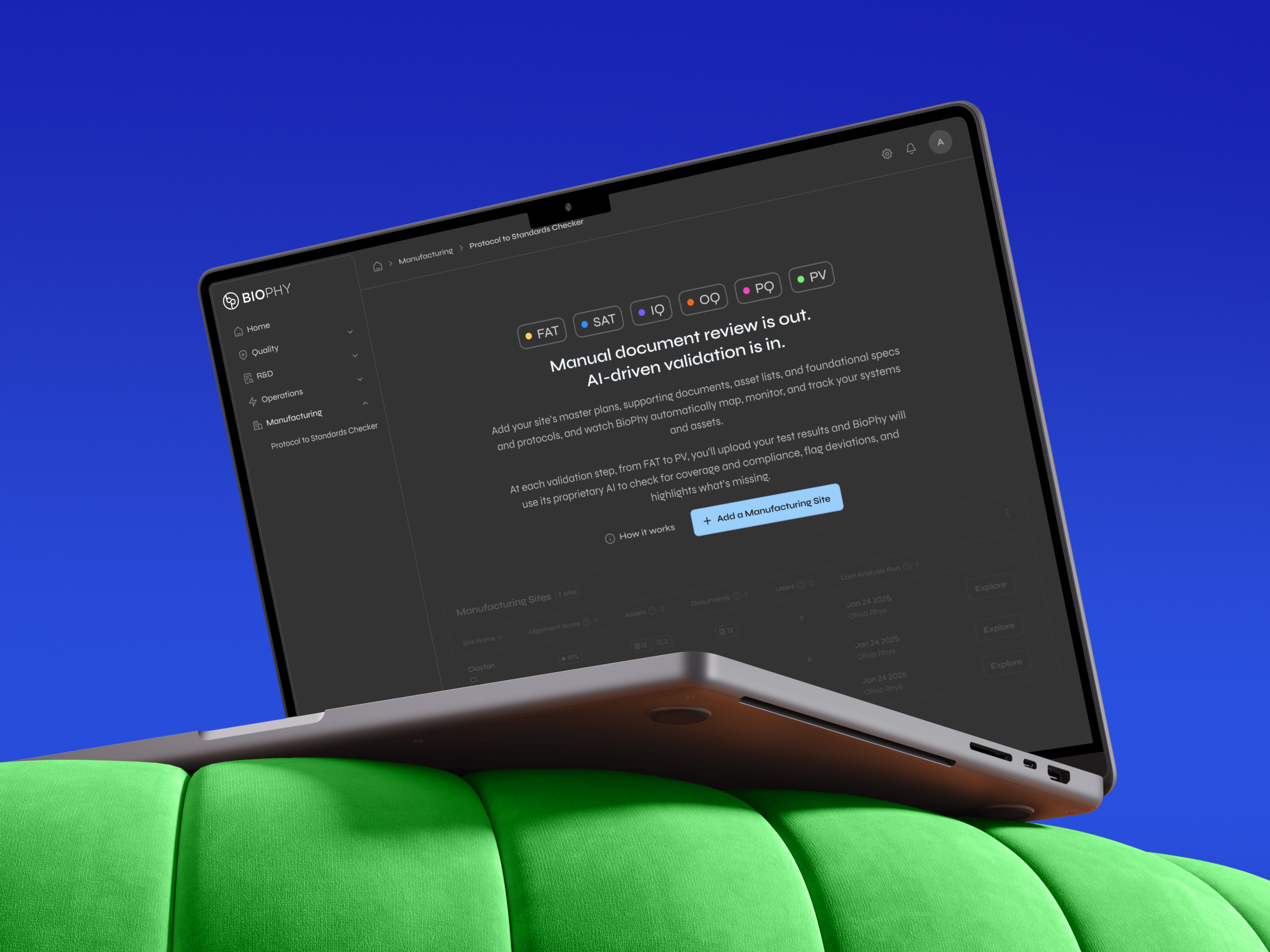
Grubhub
Designed and front-end developed a brandable web ordering SDK from concept to launch.
The new product opened a new $400K+ revenue channel for Grubhub Agency, enabling 15+ restaurant chains across 3,000+ locations to offer custom-branded online ordering, at 80% lower cost than traditional agency solutions.
Overview
Lead Product Designer and Front-End Developer
2017 – 2018
Complete responsive web SDK designs and interactions
Component library with 100+ configurable UI elements
Configuration system for multi-brand deployment
Documentation and implementation framework
Custom React components for client-specific features
Product Manager - Scott Kominsky • External development teams (Angular → React rebuild) • Internal stakeholders: Sales - Allyson Klineman, Client Success, Engineering Leadership

Grubhub had built its enterprise B2B reputation on native mobile apps for large restaurant chains. These 100+ location franchises weren't willing to share brand real estate. They wanted a seamless ordering UX and not a third-party-looking checkout experience, yet couldn't justify the $50K-$200K custom dev costs for months of work.
I proposed a brandable, web-based, ordering platform built for a reasonable cost and speed. The result: a configurable SDK that delivered custom-quality ordering experiences in weeks, becoming one of Grubhub's fastest-growing revenue channels.
Large restaurant chains were missing high-converting desktop orders, but the existing web options were too costly or killed their margins.
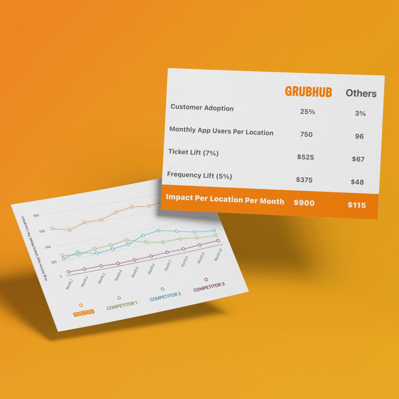
Desktop ordering peaked during lunch hours (11:30 AM - 1:30 PM) and converted at 2-3x higher rates than mobile. Yet chains faced a costly trade-off: choose third-party marketplaces consumed 20-40% of every order while sacrificing brand control, or custom agency builds at $50K-$200K and 6+ months.
With digital orders growing 23% annually, chains needed a fast, affordable way to capture high-converting desktop traffic without bleeding margin.
To capture market share by delivering what enterprise customers wanted: branded web ordering that launched fast and at a fraction of cost.
Grubhub had 50%+ of the food delivery market yet was leaving money on the table, losing enterprise business to custom agencies. Existing clients like Dig Inn and Potbelly were already paying external agencies to build web ordering despite having Grubhub-powered mobile app, a clear signal of unmet demand.
With 52% of consumers preferring restaurant-owned channels and Grubhub's infrastructure (loyalty, payment, ordering providers), they could build the product to serve enterprise web needs.
Visual Walk-Through

how it all came together
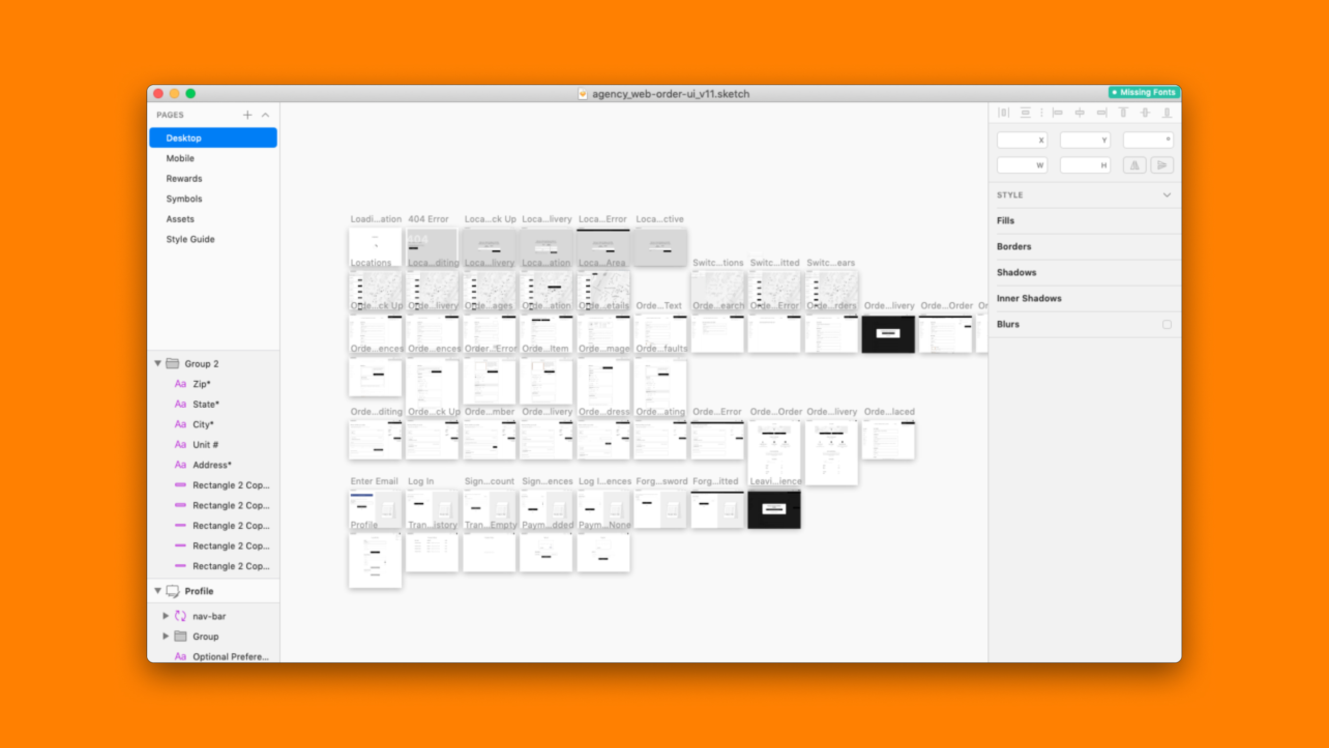
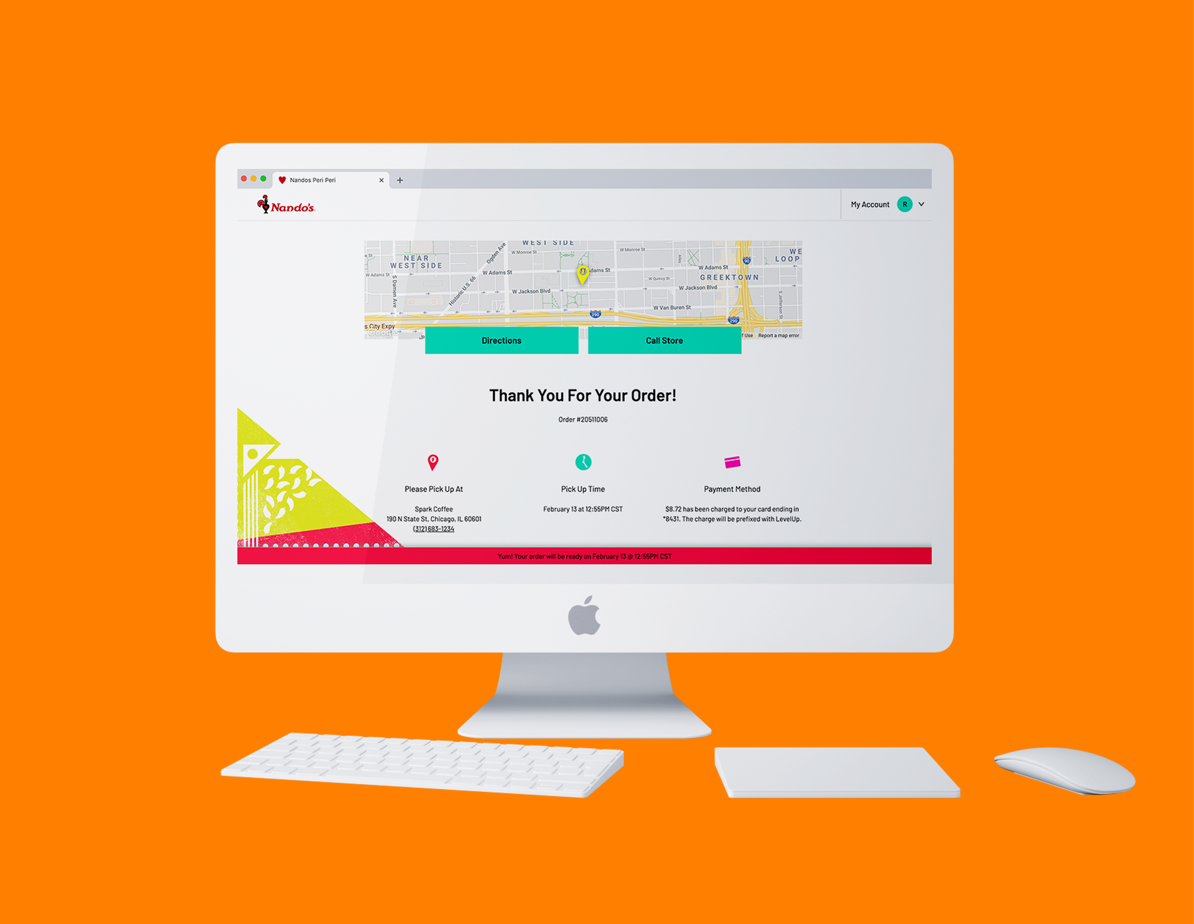
The journey started with tons of market research and competitive analysis of leading ordering flows (Panera, Sweetgreen - another existing client, DoorDash) and whiteboarding user journeys with my PM. After 11 (!!) wireframe iterations removing unnecessary complexity, I built interactive prototypes for testing. An external team built the initial version in Angular, but the framework couldn't support the configurability needed; I pushed for a React rebuild, personally transitioning into a hybrid role and styling the first 6+ clients (Chase Pay, Nando's, Honeygrow, Burger21). Finally, while building custom components, I evenutally hired the development lead who would scale the product.

Design Process
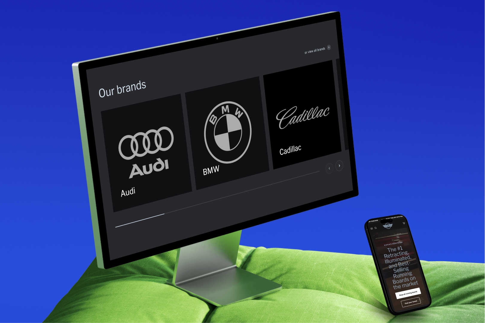
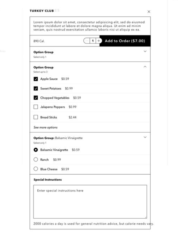
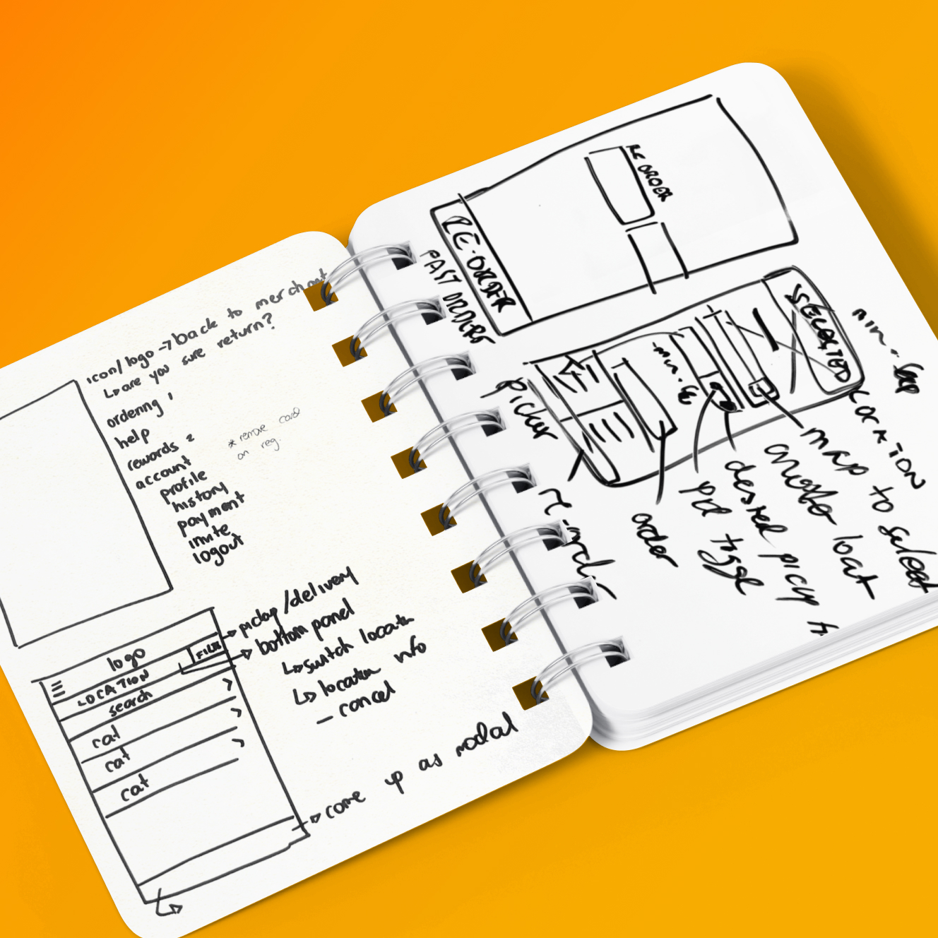
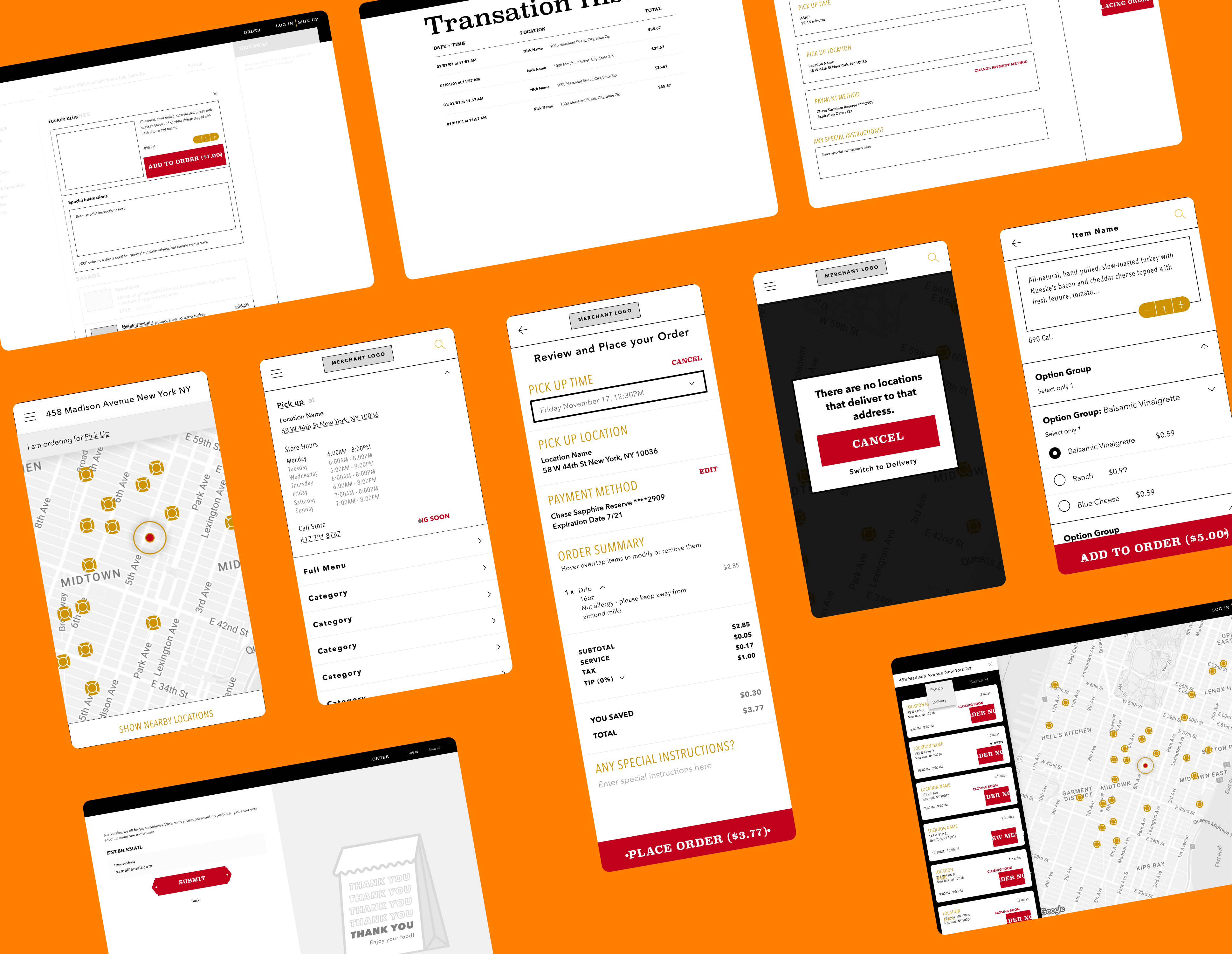
I designed and developed a brandable ordering SDK from scratch: a responsive, feature-rich, web app with 50+ screens, configurable components and layouts, and rapid brand deployment architecture.
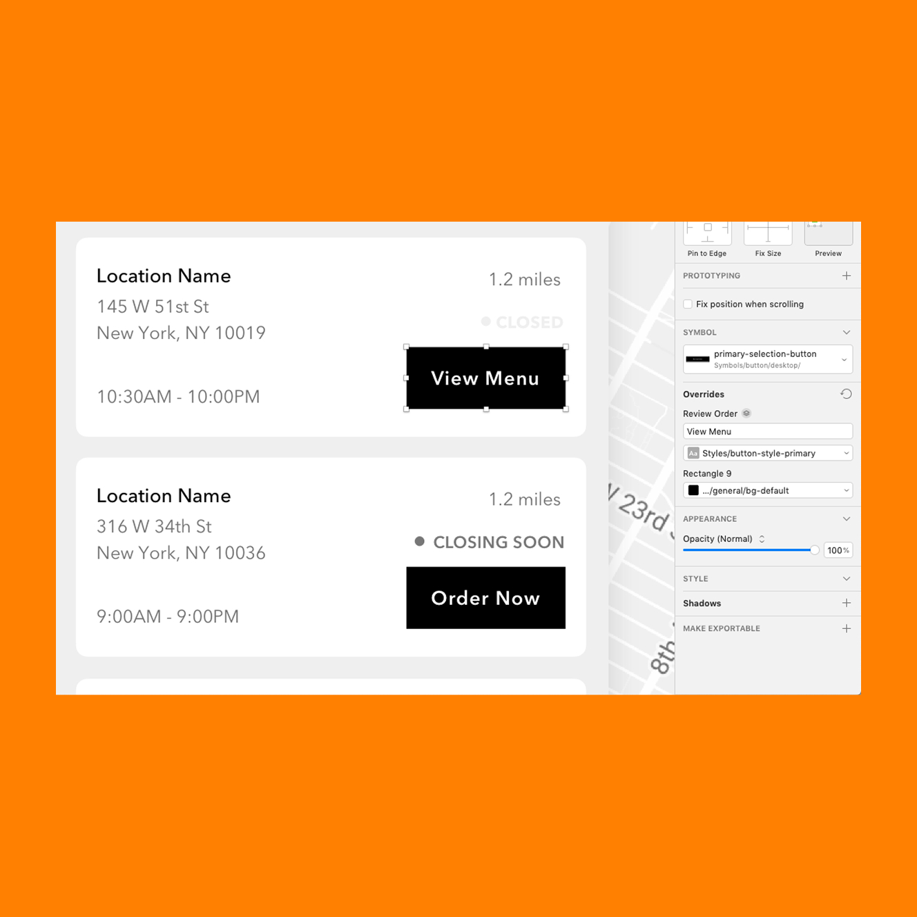
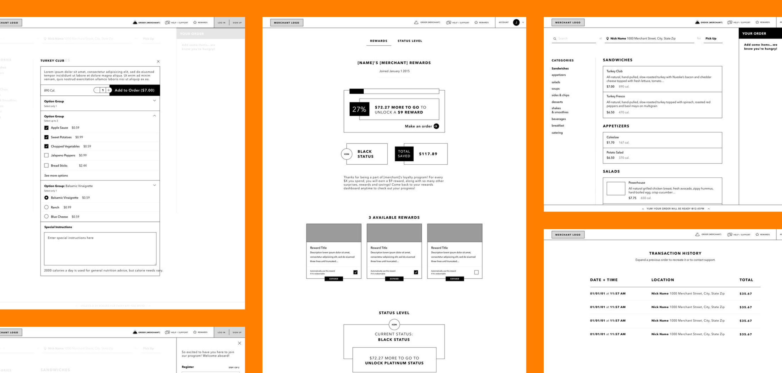
The SDK covered each customer journey: location finding, menu browsing, item customization, checkout, account management, and rewards.
I designed for accessibility (keyboard navigation, screen readers, language support), with full interaction design for all states (hover, empty, error, loading), and created a brand application system that let each client white-label the experience through configuration files rather than custom code.
On the development side, I built the React component library (header, footer, menu layouts, cart, checkout) and SASS styling system with configurable variables, that would enable the team to scale.
Responsive Ordering SDK
50+ screens covering location finding, menu browsing, customization, checkout, account management, and rewards across desktop and mobile
Component
Library
Configurable UI library with brand variables, interaction patterns, accessibility standards, and white-label theming that enabled consistent experiences across clients
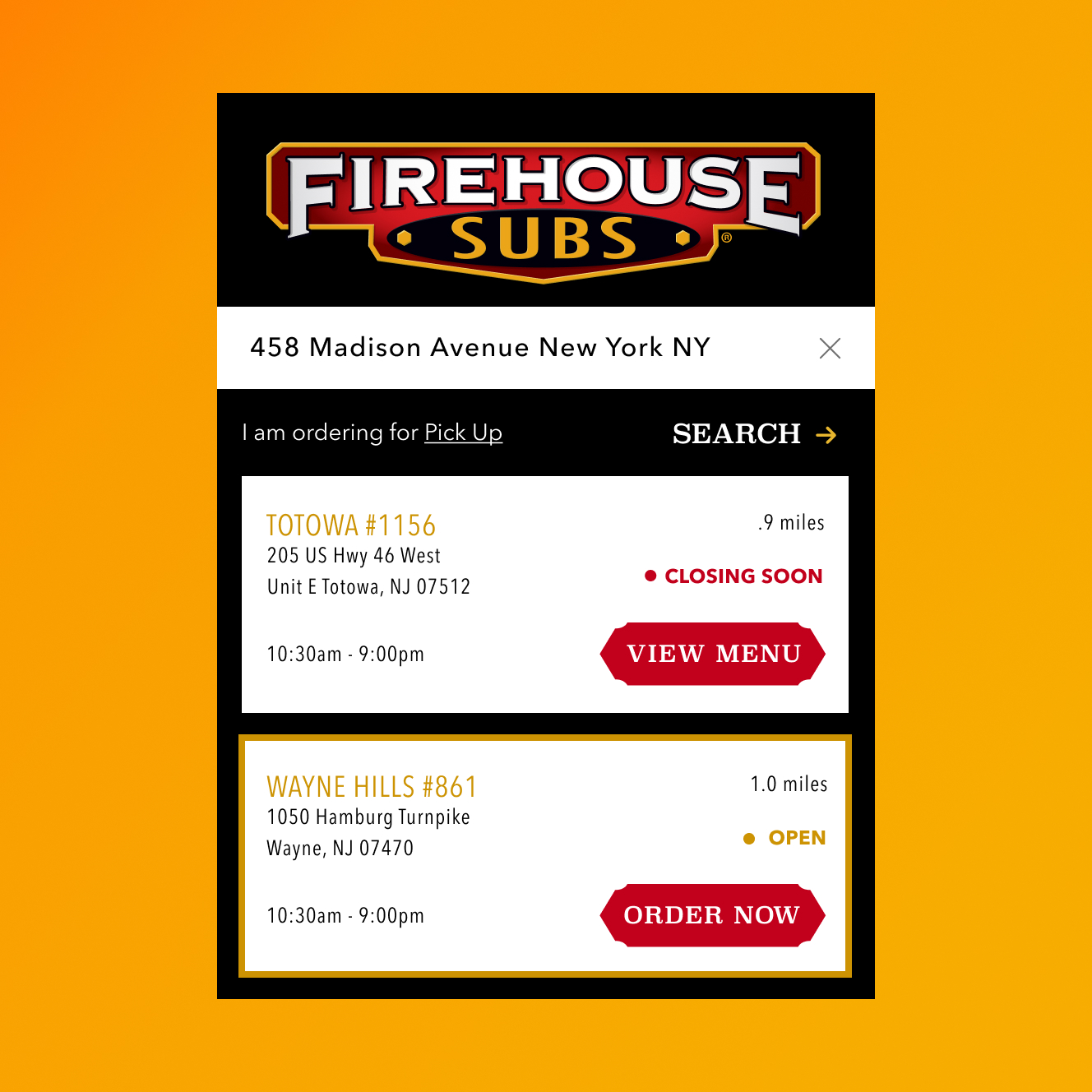
Client Implementation
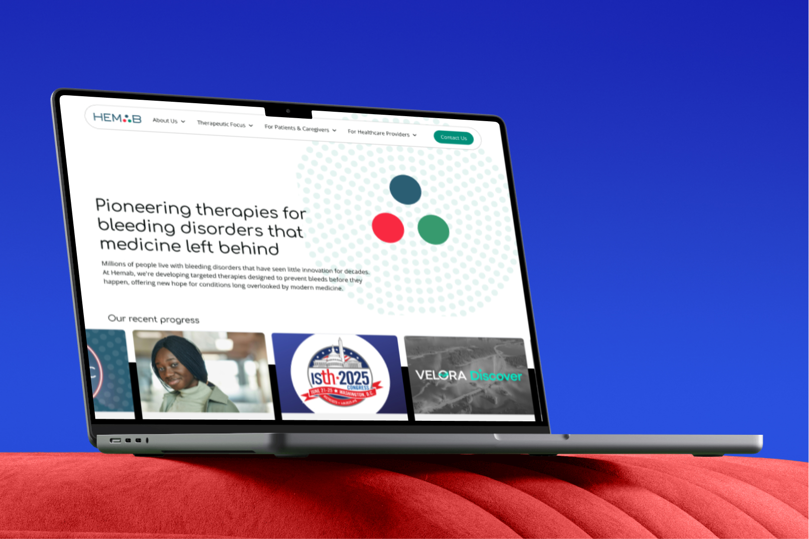
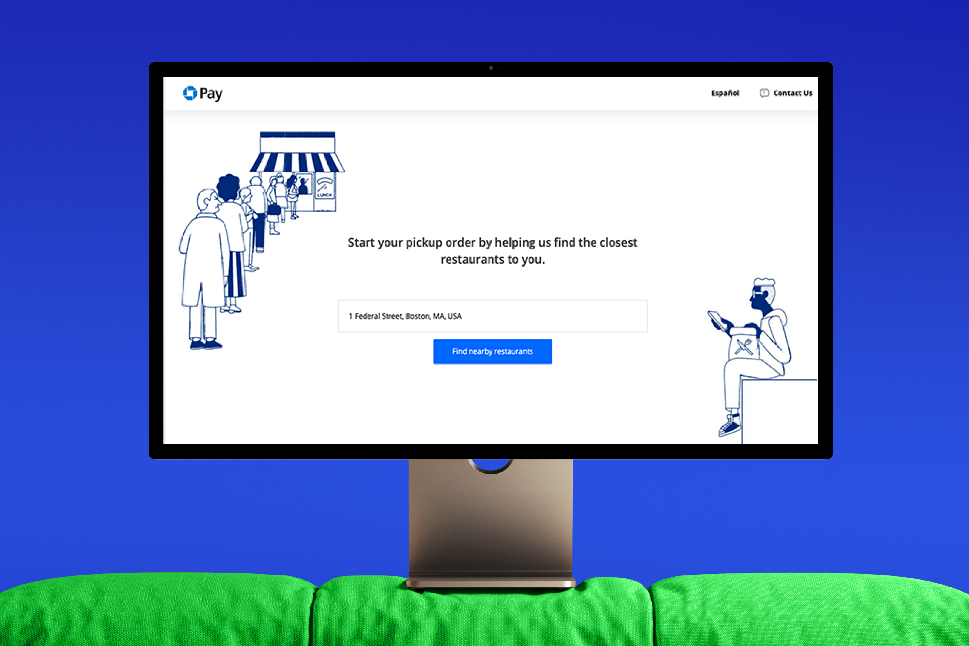
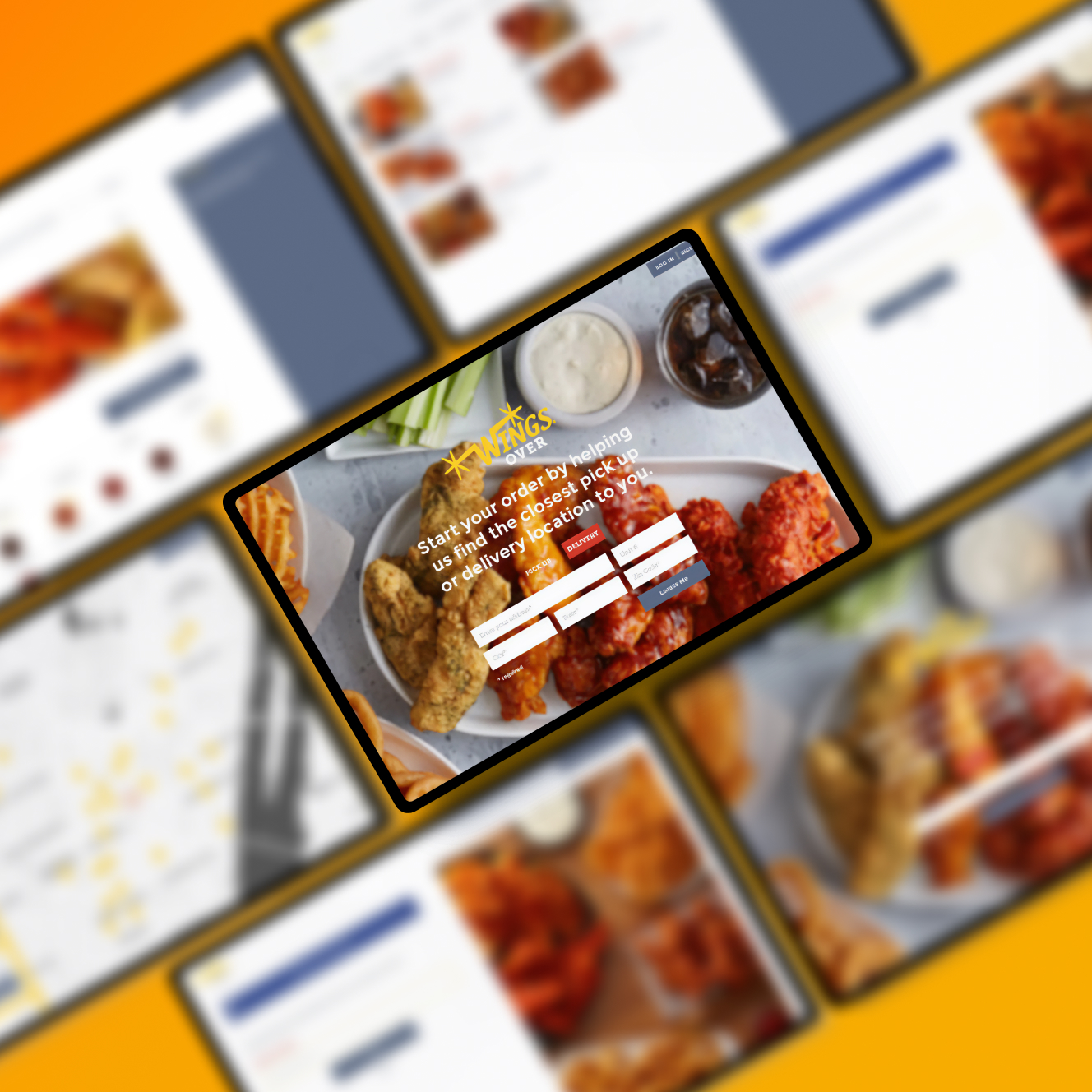
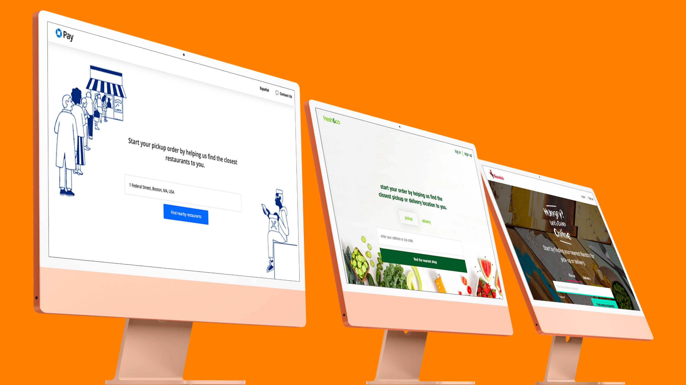
Branded deployments across major chains (Chase Pay, Nando's, Smoothie King, Honeygrow) spanning 3,000+ locations
framing and metrics of success
Find nearby locations quickly and start ordering with minimal friction
Customize orders or re-order accurately, and complete checkout and order pick up confidently
Access account features across devices like: saved payment methods, order history, and loyalty/rewards

Capture enterprise market share from custom agencies and competitors
Build resale-ready custom features into SDK for upsell opportunities (same strategy as native mobile app channels)
Scale efficiently with configurable architecture that wouldn't burden the team

Extreme variation in brand needs, menu complexity, and UI direction
Each client had different requirements, like Chase Pay's WCAG 2.0 AA accessibility or menu structures ranging from 20 items to 100+ with customization, time-scoping, and strict brand guidelines. All of this had to be handled through configuration, not custom code.
No in-house web development infrastructure or expertise
Grubhub Agency had built exclusively native apps, requiring external contractors to build (then rebuild in React), followed by hiring an internal team mid-project.
Solo designer resource constraints
I was the only designer for everything, at times creating bottlenecks, as I took on implementing clients' styling and building the product.


discovery, research & insights
methods used
• Competitive analysis of 12+ ordering experiences (Panera, Sweetgreen, Chick-fil-A, DoorDash) to identify best practices for menu architecture, fulfillment flows, and edge case handling
• Analysis of Grubhub's internal data on user behavior, like conversion rates by platform
• Technical evaluation of Angular vs. React for component configurability and brand implementation approaches
• Research on client pain points/needs through sales team interviews
• User journey mapping with my Product Manager to document flows and conversion friction points
key insights
Data showed lunch-rush ordering happened at desks, with desktop converting at 2-3x mobile rates and clients like Dig Inn and Potbelly were already investing in desktop experiences. This was a clear signal this wasn't just about mobile.
Configurability was the competitive advantage. Every client had unique requirements. Chase Pay needed specific WCAG 2.0 AA accessibility, some needed Spanish support, menu structures ranged from 20 items to 100+ with customization. A variable-based theming system could deliver brand flexibility without custom code.
These requested customizations meant I needed to implement a strategy for reselling custom work; when clients would inevitably request unique features, I'd add these requests to the SDK as configurable components, so any client could toggle them on or off, turning them into upsell opportunities.
design implications, in sum
1. Design for desktop first, then adapt to responsive/mobile.
2. Build a component library to configure branding, features, and layouts.
3. Design every custom feature request as a toggleable (and upsellable) component. For example, Nando's featured menu item image became a reusable React component available to all future clients
thinking in systems & scale
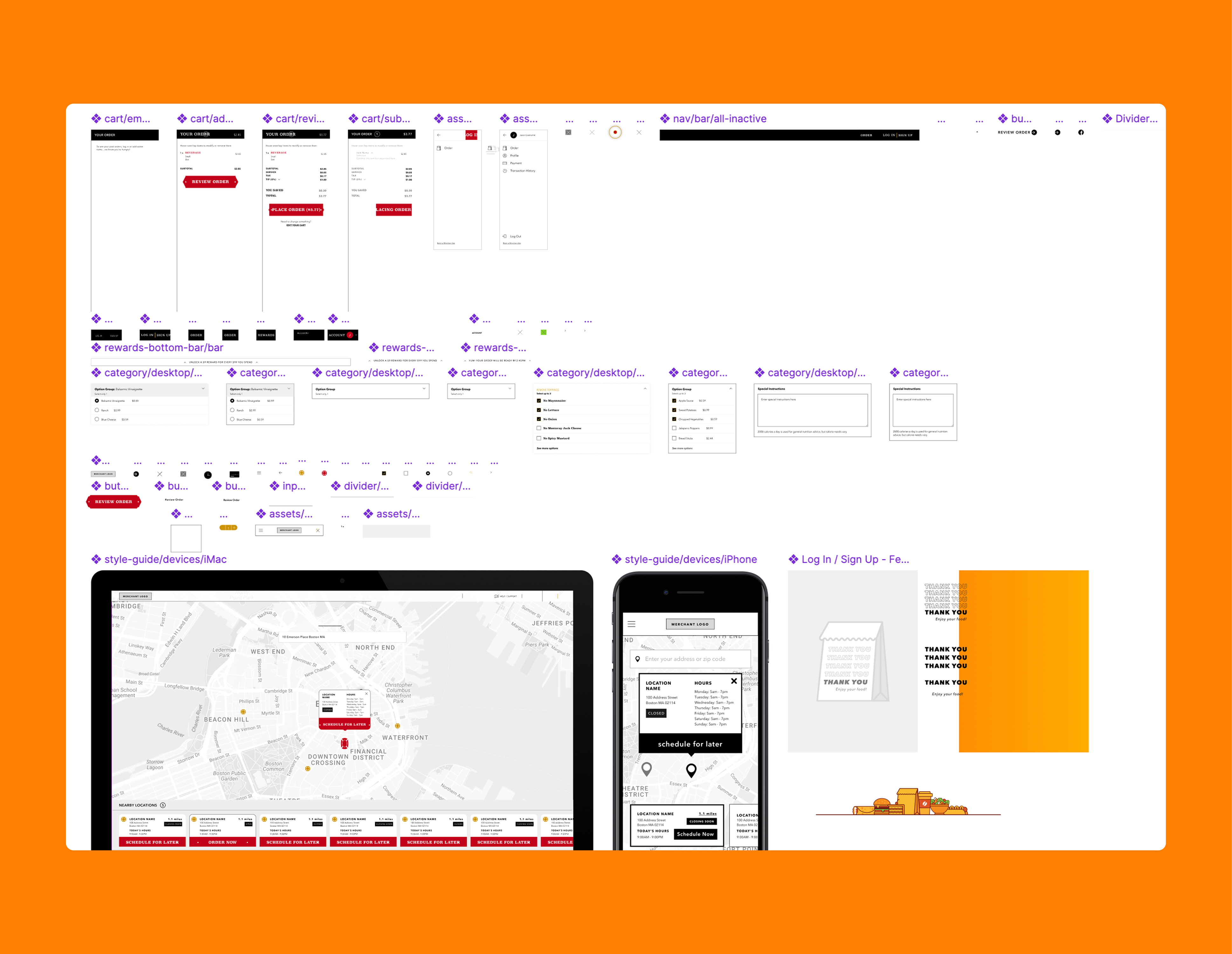
component-based architecture
Rather than building monolithic pages, I designed a library: atomic elements (buttons, inputs, typography), molecular components (item cards, location cards), and organism-level components (menu layouts, checkout flows, account dashboards).
Each component accepted configuration parameters that controlled its behavior and appearance. For example, a single "menu item card" component could render hundreds of different item types across dozens of brands.
variable-driven theming system
Instead of building separate stylesheets, the product used a SASS variable system where brands could override defaults (primary color, fonts, button radius, shadows). // Example: Base variables
$primary-color: #FF0000;
$font-family-primary: 'Brand Font', sans-serif;
$button-border-radius: 4px;
$card-shadow: 0 2px 8px rgba(0,0,0,0.1);
For each new client, there was an override file that redefined only the variables that differed from base. The SDK compiled these into brand-specific stylesheets, reducing client onboarding from weeks of custom CSS to hours of variable configuration.
configuration feature deployment
Every feature that could vary between clients was controlled by configuration files rather than code changes:
• Menu IDs: Which menus to display per location
• App IDs: Client-specific identifier for API calls
• Fulfillment types: Pickup, delivery, or both
• Language: English, Spanish, or multi-language support
• Layout preferences: Grid vs. list views, sidebar vs. header nav
• Feature flags: Location finder, rewards display, guest checkout, nutritional info
• Copy: CTA text, confirmation messages, error text
This meant sales could commit to feature configurations during contract negotiations, knowing we could deliver without custom development.
react over angular and rebuilding
The initial SDK was built in Angular, but passing configuration variables through deeply nested components was cumbersome. React's props system made it much simpler to pass brand variables, feature flags, and layout settings down the component tree without complex workarounds.
I advocated for a complete React rebuild; the decision added 2 months to timeline but enabled the scalability that made the product successful.
visual strategy
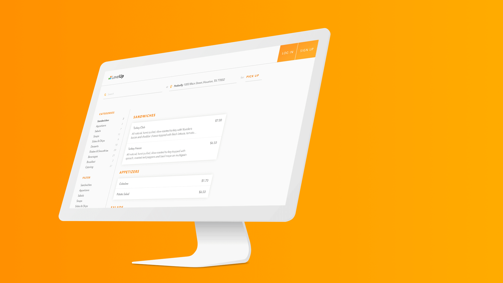
desktop-first responsive design
Unlike typical mobile-first approaches for ordering, I started with desktop layouts given user data showing lunch-rush ordering from office computers. Grubhub's clientele were mostly lunch-rush franchises.
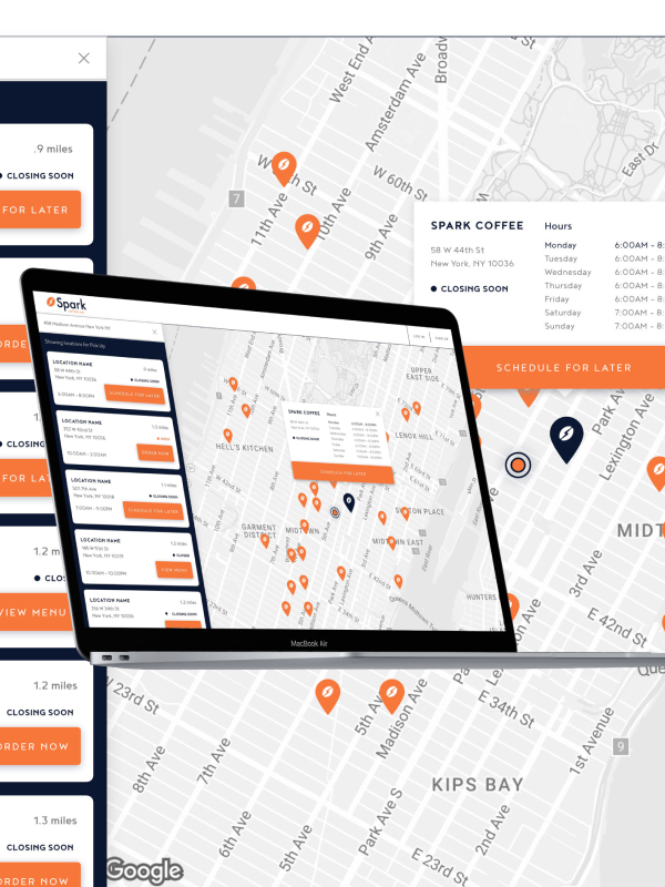
Desktop (1280px+) users, who converted at 2-3x higher, had full-featured layouts with sidebar navigation and multi-column grids; tablet (768px-1279px) condensed grids but maintained core structure; mobile (<768px) used single-column layouts with hamburger navigation and touch-optimized controls.
brand flexibility
The SDK needed to feel native to each brand while maintaining UX consistency:
• Constrained flexibility: Brands could customize colors, fonts, imagery, button styles, card treatments, but not interaction patterns or information architecture
• Style guide compliance: Documentation showed which elements were customizable (headings, CTAs, backgrounds) vs. fixed (form validation, error messaging, accessibility features)
• Visual hierarchy preservation: Critical elements (add to cart/bag, checkout, price) maintained prominence regardless of brand styling
• Scalable asset system: Logo placement, hero imagery, category thumbnails worked across brand aesthetics
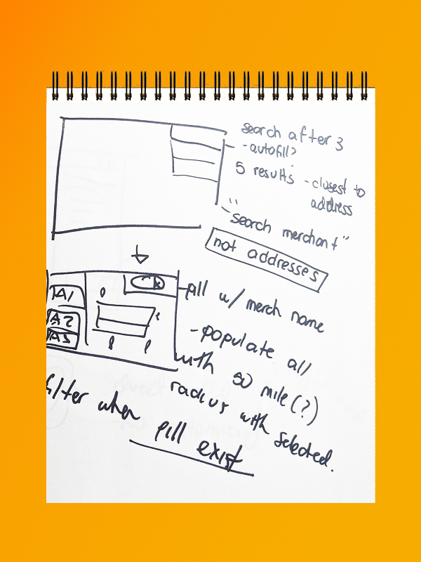
information architecture for complex menus
Restaurant menus varied wildly, from shallow menus with 20 items (Wings Over) to deep menus with 100+ items and heavy customization (fresh&co, Chase Pay). Design solutions included:
• Sticky category navigation for quick-jump to sections
• Collapsed customization where modifiers stayed hidden until item detail
• Smart filtering (dietary, ingredient, calorie) that persisted as users browsed
• Visual meal building for bowl/sandwich builders showing selections in progress
key interaction and feature patterns
• Location finding: Geolocation for instant nearest locations, with manual override; map + list views; clear pickup vs. delivery availability
• Menu browsing: Item cards with quick-add for simple items vs. detail modal for complex customization; running total showing price updates
• Cart & checkout: Persistent cart visibility in header; easy editing without leaving cart; guest checkout option; payment flexibility (credit, saved payment, gift cards)
why it mattered
Desktop-first approach aligned design investment with the highest-converting user segment. Brand flexibility let brands maintain identity while benefiting from Grubhub infrastructure. Polished, ready-to-deploy features became a sales differentiator in demos.
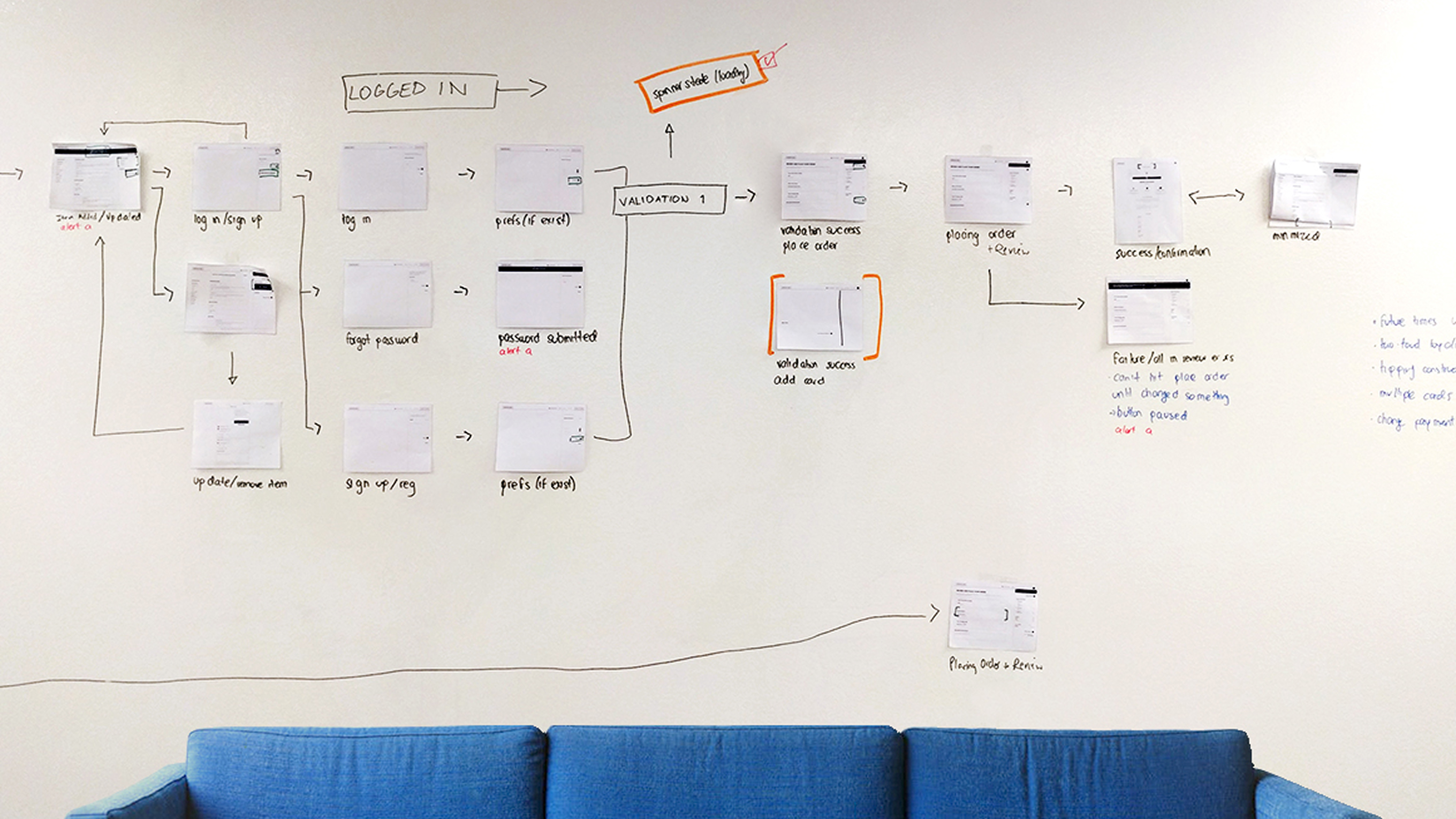
validation, testing, and tracking
strategic testing approach
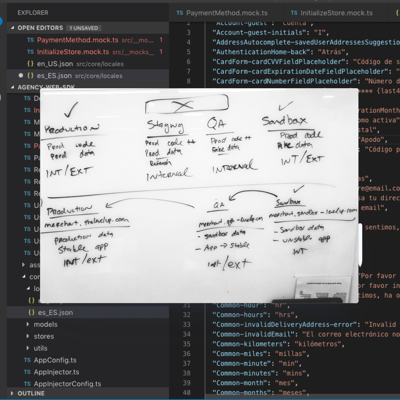
With no existing web QA at Grubhub Agency, I decided on a testing strategy: development with mock data for rapid iteration, staging connected to QA APIs for integration testing, and production for live validation.
Rather than comprehensive testing that would slow launches, I prioritized what mattered most: cross-browser consistency for the highest-traffic browsers, device testing, and performance thresholds that directly impacted conversion (<3s page load, <5s interactive). This approach enabled 4-6 week client launches while maintaining quality.
metrics that informed decisions
I defined metrics across four layers to make strategic product decisions, not just track performance:
• Technical: Page load and API response times flagged infrastructure issues before they affected conversion
• User behavior: Conversion funnel and cart abandonment data validated interaction design choices
• Business: Time-to-launch and revenue per client proved the configuration model worked
• Client success: Order volume
These metrics drove pivots like when Chase Pay accessibility testing revealed gaps, causing us to fix ARIA labels standard for all clients.
phased rollout as learning strategy
Rather than launching everywhere simultaneously, I designed in phases:
Phase 1 (months 1-6):
Proof of concept with easy clients that validated core ordering flows and identified common customization needs.
Phase 2 (months 6-8):
Chase Pay as flagship demonstrated Fortune 500 capability and reputation.
Phase 3 (months 8-10):
Rapid deployment of Nando's, Smoothie King, and Wings Over proved the configuration system worked, achieving <6 week launches.
Phase 4 (months 10+):
Team transition, hired full-stack lead, documented architecture.
trade-offs
What I Prioritized
shipped core flows, skipped advanced features
Custom agencies were really closing deals we couldn't compete for. I pushed to launch with basic ordering (location, menu, cart, checkout) instead of waiting for gift cards, delivery tracking, or full loyalty features. Guess what? first client live in 6 months, 10+ within a year.
desktop-first when everyone else went mobile
With higher conversion on desktop during lunch rush, I optimized there first. Sales used polished desktop demos to differentiate from mobile-first or mobile-only competitors and close enterprise deals.
rebuilt in React mid-project
Angular couldn't handle the level of configurability. My advocacy for a complete React rebuild was a non-negotiable. The component architecture was the only way this would scale.
What I Said No To
one-off client requests (that I didn't beleive we could really resell/upsell)
When Nando's wanted a featured menu image, I didn't build it just for them. I built it as a toggleable component any client could use. When we had crazy one-off-type requests that I hypothesized to not impact conversion, I said no (kindly).
matching native app features
Clients asked about push notifications, offline ordering, and advanced loyalty because our native apps had them. Web and native solve different problems. I focused on web's strengths and shipped what mattered.
polished animations and micro-interactions
Sales loves a smooth transition and animation. I built beautiful loading states, but animations weren't moving conversion and would've slowed launches.
key design decisions
Component-based architecture using variabled configuration
What I DID
Designed every component to accept config parameters instead of hardcoded values. New clients got a config file, not custom CSS or React code.
Why it mattered
This wasn't obvious. Building custom per client would've been faster for the first 2-3 clients and generated immediate revenue. But I knew we'd hit a wall: every new feature would require rebuilding per client. Configuration was slower to start but exponential scale. The bet paid off when we went from 3 clients to 15 without even needing to growing the team.
Desktop-first design aligned with user data
what I DID
Optimized for desktop (1280px+) first, then adapted down to mobile—opposite of industry standard.
why it mattered
Everyone was building mobile-first in 2017. Going against this trend required conviction and data to back it up. While competitors demoed mobile apps, we showed enterprise-grade desktop ordering that looked like it cost $200K to build AND the data to back it up. Sales used it to close deals.
Built custom requests as reusable or upsells
whAT I DID
When a client paid for a new feature, I baked it right in as a toggleable component any client could use.
why it mattered
This one and done approach turned one-time fees into recurring upsells and kept us shipping fast. The pattern held: most custom requests became SDK features.
Results and Thoughts
Within 10 months, I shipped an entire web SDK that powered restaurant chains across 3,000+ locations, generated $400K in year-one revenue, and established web development capability at a one-native-only company.
did we hit those metrics of success?
10+
Target was 5-8 chains and 400+ locations. Exceeded by 3x on clients, 7.5x on locations with brands including Chase Pay, Nando's, Smoothie King, and Honeygrow.
$400K
Target was $200K flat + $20K monthly. Hit $250K in implementation fees plus $150K monthly recurring ($400K total first year), exceeding targets by 25-100%.
Weeks
Target was <6 weeks. Met goal (averaging 4-6 weeks), establishing competitive advantage against custom agencies requiring 5-6 months.
client story
—
We enhanced the SDK with WCAG 2.0 AA compliance and custom payment integration, deployed it across Grubhub's ecosystem of restaurants, and closed the highest contract yet. This validated that the product could compete for enterprise deals.
reflections

proving with shipping beats proving with decks
Grubhub invested 5 years building native-only expertise. I didn't win the web argument with research or strategy presentations. I won by shipping the first clients fast, showing revenue, and demonstrating we could compete. Now I lead with "let me show you" over "let me convince you."
your team is everything
Going from solo designer-developer to hiring the full-stack lead and watching the product scale beyond what I could build alone was deeply satisfying. The best moments weren't shipping features, they were seeing teammates deploy clients using the system we built together, solving problems I hadn't anticipated, and having the best time doing it!
push for organizational commitment earlier
I proved the market need through client success, but waiting until month 10 to get real resourcing meant we probably scaled slower than we could have. Next time, I'd make a harder push for treating this as a strategic channel by month 4-5, using early traction as leverage instead of waiting until it was "proven."
build direct feedback loops with restaurant staffWe listened to corporate clients (brand managers, marketing) but not enough to the restaurant staff fulfilling orders. Their operational pain points would've surfaced better design decisions. I'd establish regular sessions with frontline users from day one, not just stakeholders.
document why, not just what
I created great implementation docs in Confluence for developers but didn't systematically capture design rationale because of time. Why did I say no to animations? Why desktop-first? Future designers had to reverse-engineer my thinking. Now I'd keep decision logs: problem, options, choice, tradeoffs, metrics. Makes the product *evolvable*.